Amplio: Talking Book Mobile App
Building Accessible Mobile Learning: Two UX Paths for Amplio Users
Tools
Figma
Google Suite
Slack
team
3 UI/UX Designers
My Role
UI/UX Design (Low- and High-Fidelity Prototypes)
User Research and Personas
Accessibility Strategy
Timeline
Overall: 4 months
Discovery & Research: 1 month
Iterative Design: 3 months
01
Overview
Amplio's Talking Book device has provided critical educational audio content to remote communities in Sub-Saharan Africa for over a decade. Our team was tasked with adapting the device into a mobile app to expand Amplio’s impact, ensuring it remained accessible to users with limited literacy and digital experience—while also offering a modern experience for those more familiar with smartphones.
We designed two distinct user experiences:
Basic Version: A minimal, icon-driven app for low-literacy and low-tech users.
Advanced Version: A familiar mobile app experience for digitally literate users.
02
The Challenge
How do you design a mobile app that is:
Usable without reading skills?
Familiar enough for smartphone users?
Technically lightweight for rural environments with limited connectivity?
True to Amplio’s mission of inclusive, accessible learning?
We needed to design not just for different skill levels, but for fundamentally different mental models of interaction: one device-like and sequential, the other mobile-first and exploratory.


Learning
Design Constraints force creative innovation
Instead of seeing low literacy and low connectivity as obstacles, we treated them as creative constraints that would guide us to a smarter, simpler solution.
03
Discovery
Understanding the Users
We created two primary personas to guide our design decisions:
Persona 1: "Kwame" — A rural user with limited literacy and no smartphone experience.
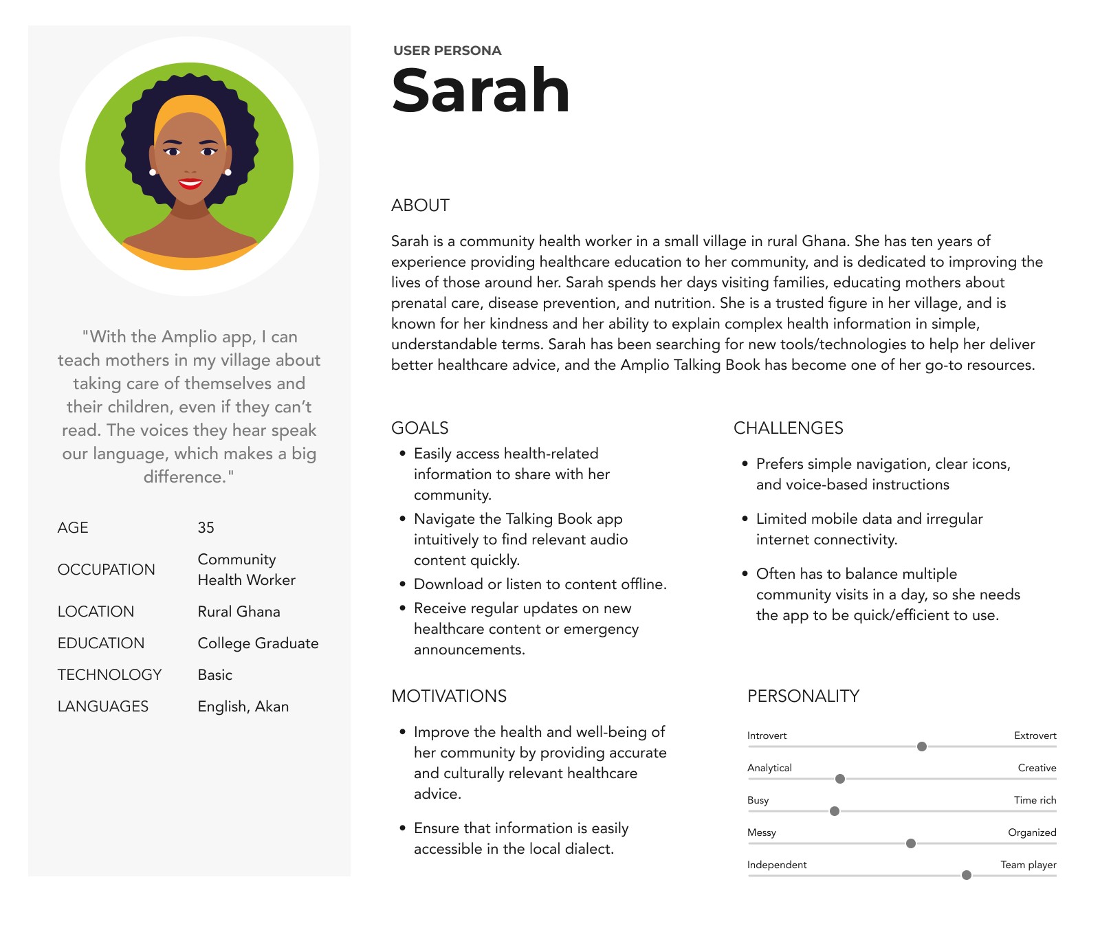
Persona 2: "Sarah" — A semi-urban user familiar with basic smartphone apps.
These personas helped us empathize with two drastically different user groups and shaped every step of our UX strategy.

Competitor Analysis
We conducted a competitive audit and studied apps targeting low-literacy audiences, including:
Audiobook players.
Educational apps.
Feature phone interfaces.

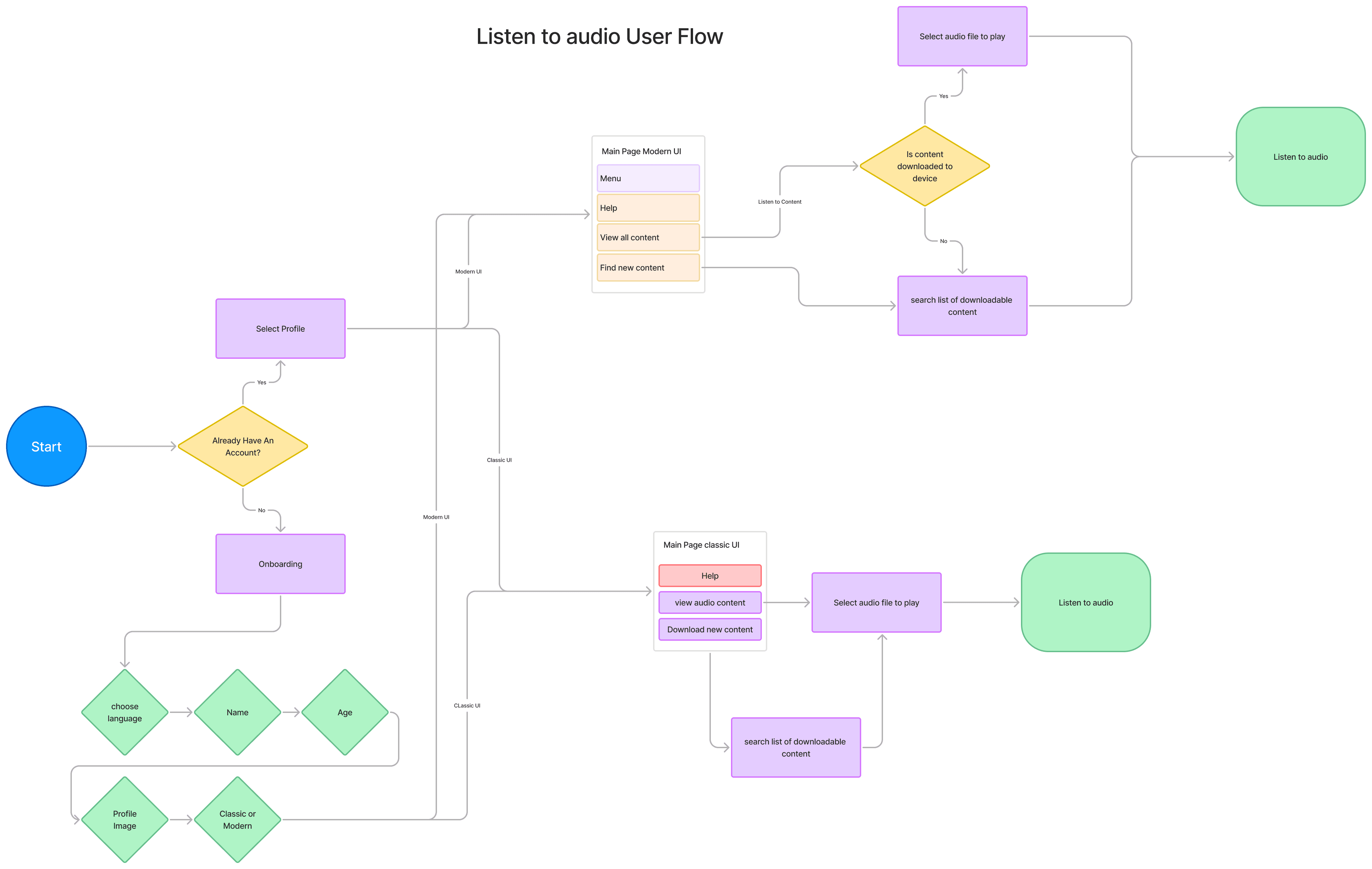
Mapping the Journey
We mapped a User Journey for Kwame and Sarah to better understand the ideal and actual paths through both the Basic Version and Advanced Version of the app.
Key Research Insights
Our research insights directly mapped to our navigation patterns: Basic users needed clear, singular action paths, while Advanced users benefited from exploratory browsing features like carousels and search.
Additional Takeways:
Audio First: Users rely heavily on audio prompts, especially those with low literacy.
Minimal Interaction: Users are more comfortable with simple, linear navigation (i.e., one main action at a time).
Recognition over Recall: Clear, consistent iconography aids memory and navigation.
Familiar Patterns: More digitally literate users expect features like swiping, dropdowns, and recognizable icons.
04
Design Approach
Mental Model Alignment
Rather than merely simplifying or modernizing the app, we crafted two distinct experiences that matched how each user type naturally thinks and navigates: a tactile, linear model for Basic users, and a flexible, content-driven model for Advanced users.
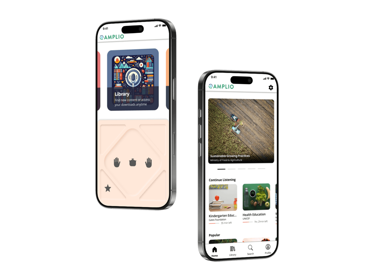
Basic Version
Designed for low-literacy, low-tech users.
Large, Touchable Buttons
Prioritizing ease of use, with a tactile feel to mimic the physical Talking Book hardware.Audio Instructions for Every Action
Every interaction was accompanied by spoken guidance.Linear Navigation
One main action per screen, guiding the user step-by-step.Talking Book Iconography
Icons were pulled directly from the Talking Book hardware, so they were direct and universally understandable by users of the physical device.
Advanced Version
For users with higher digital literacy.
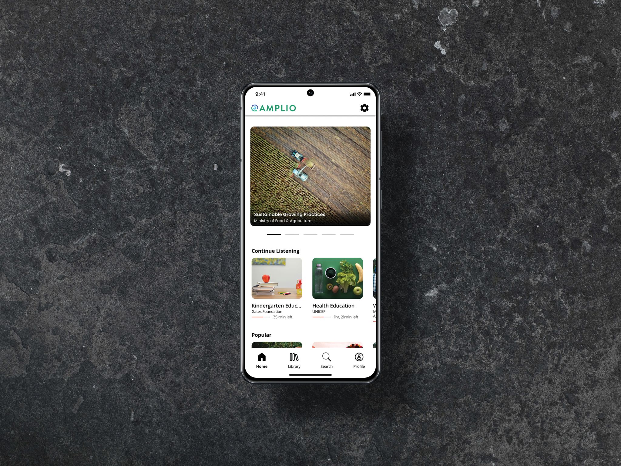
Card-Based Information Layout
Clear visual cards for lessons, designed for quick scanning and selection — familiar to users of apps like YouTube, Spotify, or podcast players.Tabbed Bottom Navigation
Standard home, library, search, and profile tabs to promote intuitive, learnable navigation patterns.Progress Indicators
Visual playback progress bars under each lesson, helping users quickly resume listening without re-listening or searching.Horizontal Scroll Carousel
The top section features a swipeable carousel for featured content, offering a familiar discovery mechanic.Minimalist Visual Language
Clean use of white space, bold headlines, and subtle shadowing helps users prioritize and differentiate content at a glance.


Learnings
01 - Linear, minimalist UX Empowers users who struggle with choice
Too many options overwhelm low-literacy users — clarity and "one action at a time" design were critical.
02 - Progressive disclosure reduces friction
Giving users only what they need, when they need it (especially during onboarding), helped match cognitive load to user ability.
03 - Accessibility isn't a feature, it's foundational
Accessibility was foundational, not additive: from large tap zones to offline access, every feature was designed to reduce barriers.
05
Outcome
We delivered two complete mobile UX prototypes, designed and user-tested, with clear next steps for Amplio’s engineering and implementation teams.
Impact:
Made Amplio’s critical educational content accessible to a broader, global audience.
Expanded inclusivity for users who traditionally get left behind by standard app design practices.
06
Reflection
This project reinforced the importance of designing for extreme users, not just average ones. It challenged us to rethink assumptions about interaction models, literacy, and what "good UX" means when the user can't rely on reading, typing, or even conventional icon understanding. This project also taught me that inclusivity doesn’t mean compromising on user experience. With thoughtful research and intentional design, it’s possible to craft multiple pathways that feel equally polished, empowering every user to engage confidently.