Art with Heart
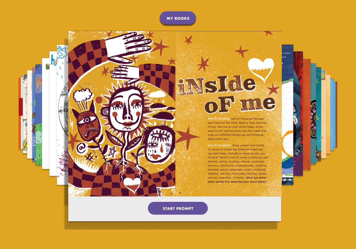
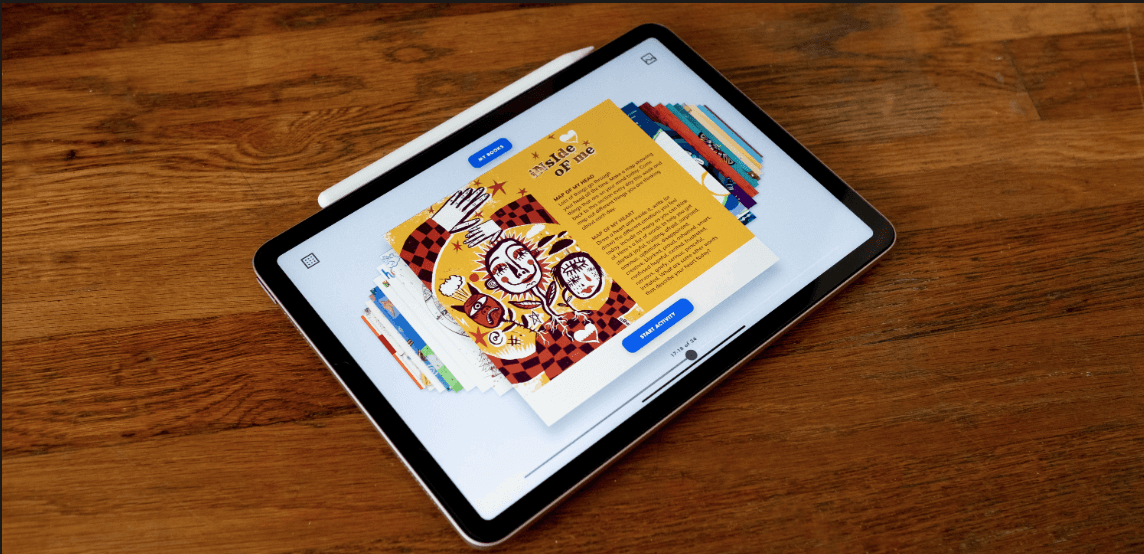
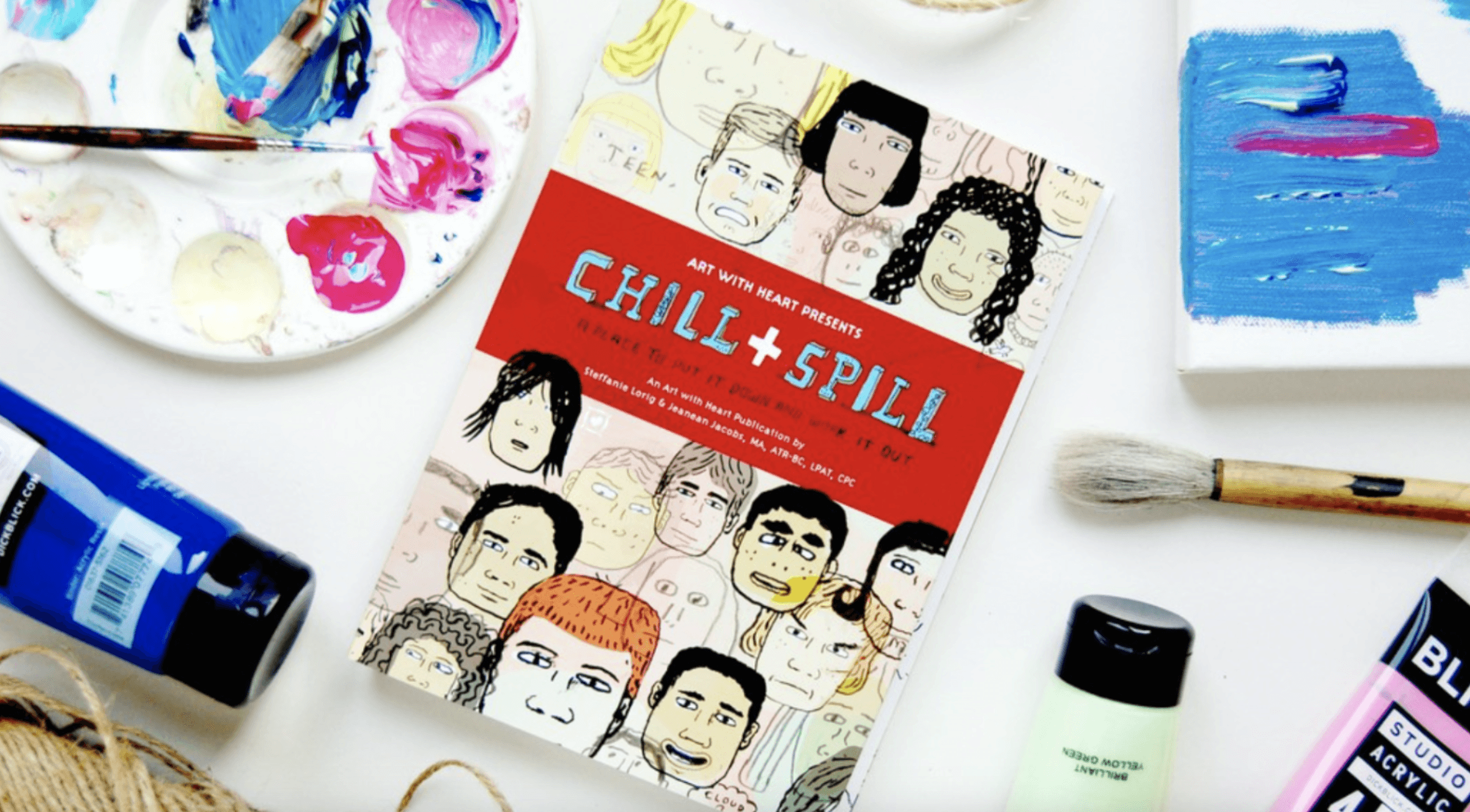
Art with Heart is a branch of the Childhaven organization, which focuses on helping children to work through personal trauma through the healing power of creative expression. They make therapeutic activity books, and they wanted to find a way to digitize their products into an app so they can expand their influence to a wider audience. One activity book, called Chill & Spill would be the "guinea pig" to see how to go about this.
my role
Team of 4 UX Designers
I was responsible for:
UX research
UX design & prototyping
UX writing
timeline
Overall: 10+ weeks
Research: 2+ weeks
Design & testing: 8 weeks
tools
Figma / Figjam
Slack
01
Problem(s)
Problem 1
How might we digitize Chill & Spill for artistic expression?
Chill & Spill is an interactive book with reading, writing, drawing, and collage activities. We needed to create an immersive book experience in app form with integrated digital art tools, so kids could express themselves creatively as they made their way through each activity.
Problem 2
How might we make the app scalable?
We also wanted to create something scalable that would eventually house the three other Art with Heart books, as well as any future offerings. So although Chill & Spill was the focal point, we essentially were designing an app for Art with Heart as a whole.
02
Research
User Interviews (8)
Unfortunately we did not have access to interviewees in the 12-18 age range, the demographic of Art with Heart's client base. We made due with older interviewees (around ages 27-33) with the following goals in mind:
Observe how people interact with the print version of Chill & Spill, to establish a baseline of engagement.
Identify what art utensils are preferred when completing an activity
Track users’ emotional states before, during, and after completing an activity from the book, so we'd have a point of comparison when testing the digital version later on.

Learning
measuring emotions
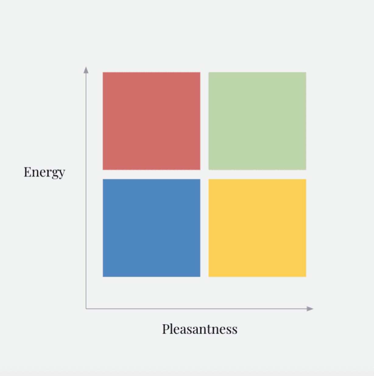
Our Mood Tracker wasn't all that useful after all. Considering some of the activities in Chill & Spill require working through traumatic experiences, we realized that our scales of "Energy" and "Pleasantness" weren't accurate representations of how an activity could benefit a child. We decided not to use it to track emotional states when conducting final user tests.
In the future, we'd likely ask more poignant questions of test participants, such as...
"On a scale from 1-10, how helpful was this activity?"
"Would you consider using Chill & Spill activities in the future?"
"What did you enjoy about this activity? What would you change?"
"Did you feel anything was missing during your creative process?
Activity: Art Tool Organizer (8)
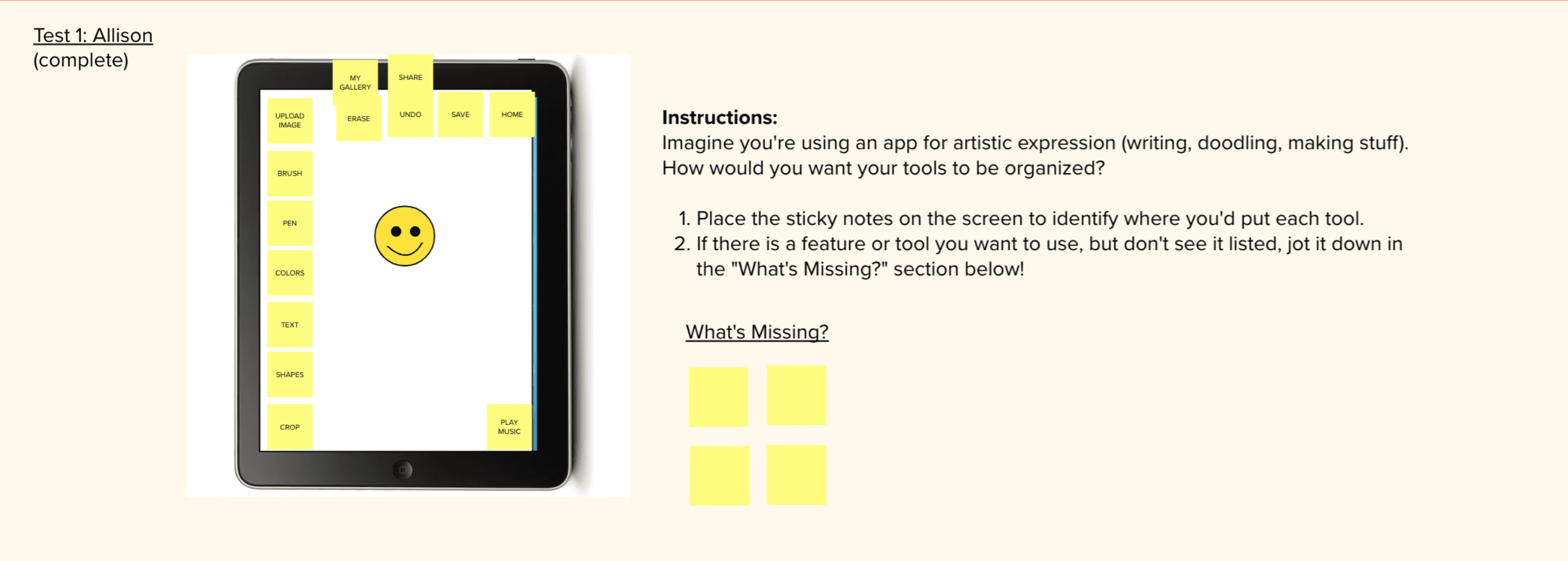
The app would need to include a space for drawing, writing, and making things. So, we had to find out how artists would want their art utensils (pens, pencils, text, eraser, etc) to be organized on screen.
We asked participants to arrange sticky-notes (each representing a specific art utensil) on an iPad screen, to identify where they expected each art tool to be found.
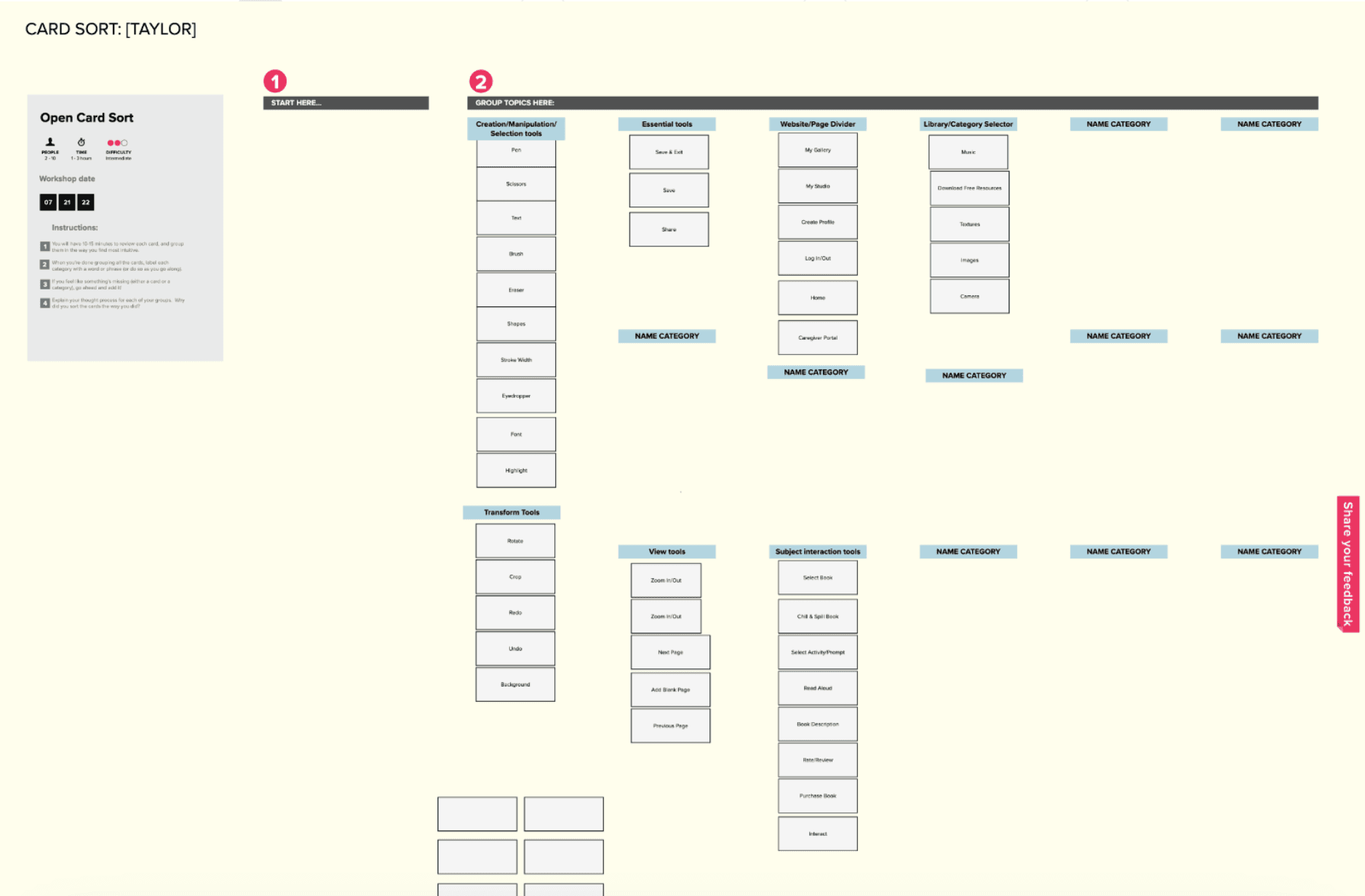
Card Sort (8)
The main goal for our card sort was to identify site structure and global/local navigation.
Competitive Analysis
Art therapy books, e-readers, creative social media, etc.
We needed to find out what design concepts/inspirations we could take from physical books, and how we could enhance that experience of drawing and writing in a digital format.
03
Design
User Journey
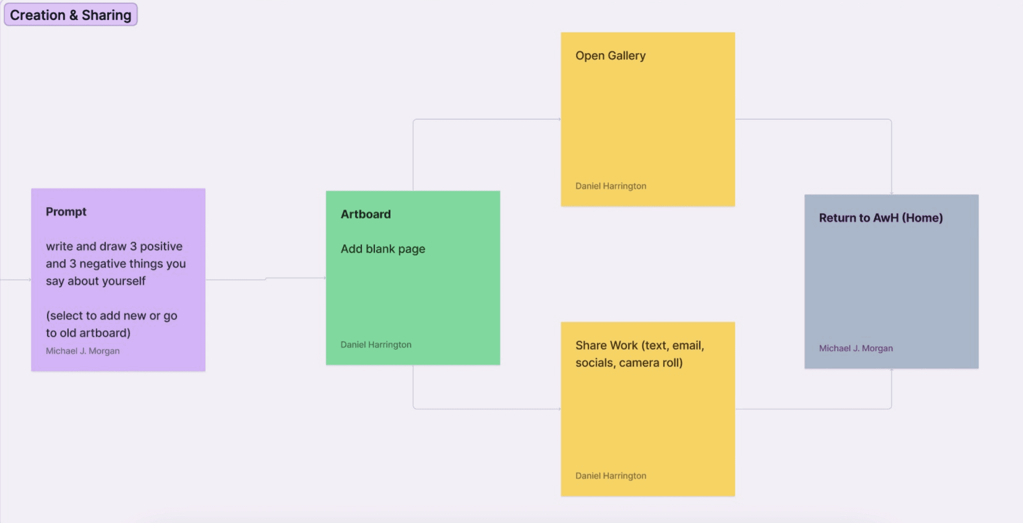
We starting by mapping out the user flow so we could take stock of each page we'd need to build out. The user flow was divided into four main sections (though these labels weren't added until later in the design process):
Onboarding → Home Page → Book View → Creation & Sharing
We knew the onboarding process and Home Page were going to be relatively simple design solutions. So, we decided to focus our efforts around the Book View and Artboard. We had two key ideas in mind when approaching these designs:
book view - a tactile experience
We wanted to retain the tactile nature of the print version of Chill & Spill. We felt we could accomplish this by creating a “flippable” book view, so artists could swipe through each activity in the text as if flipping pages in a physical copy.
artboard - expanding beyond physical art media
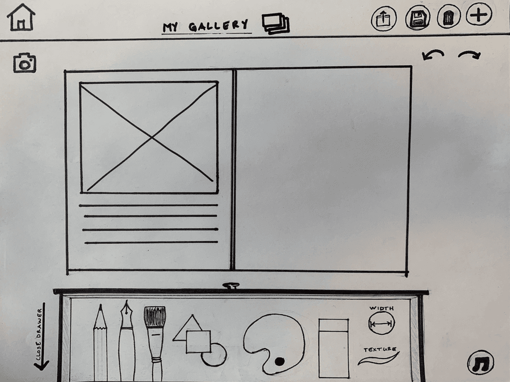
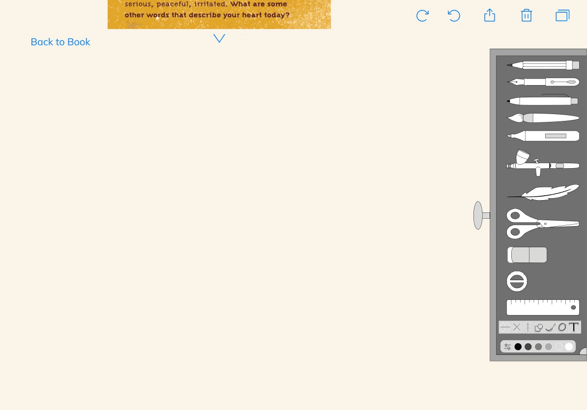
We recognized that physical art media have their pitfalls (they're messy, time consuming, expensive, etc). So we explored design solutions that would make artistic expression more convenient. We designed an artboard, which acts as the “creative hub” for the artist. It contained a Tool Drawer for all art utensils, undo/redo buttons, the ability to share or delete artboards, and a hide-able overlay to remind the artists of the activity at hand.
Sketch
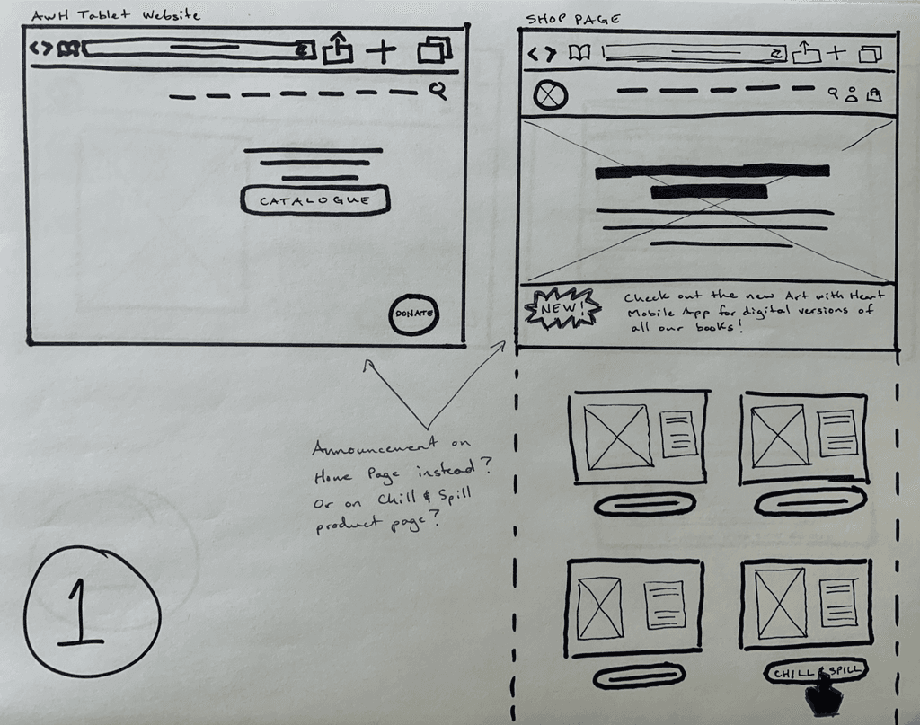
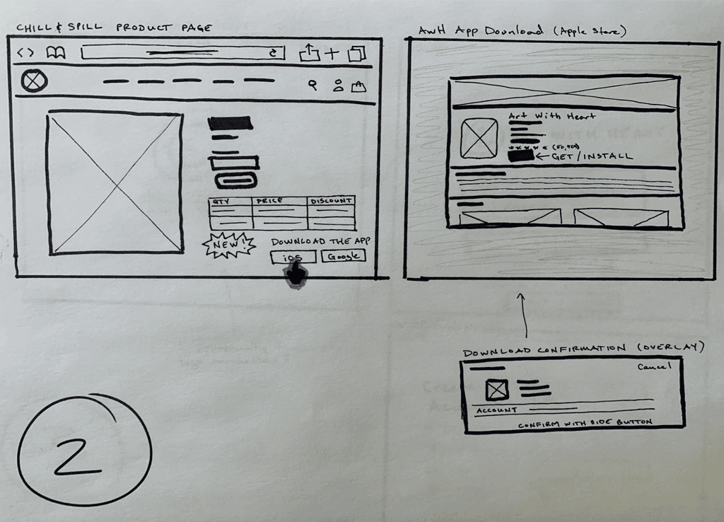
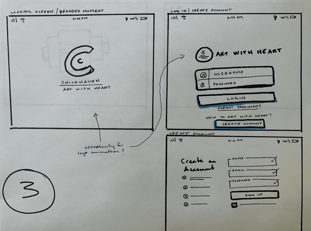
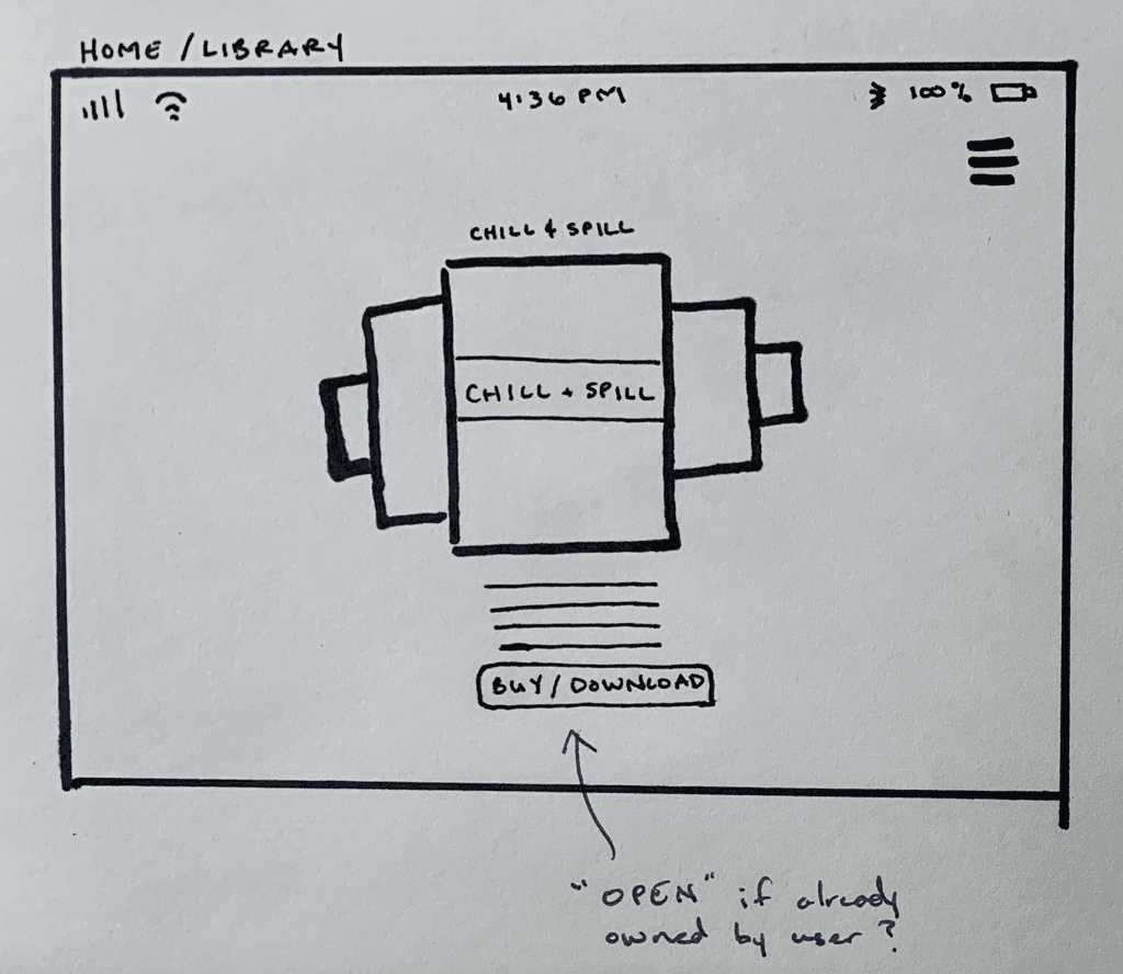
We used the user flow as a template for putting together some initial sketches. They would reflect the user's journey from App Download all the way through to the Artboard.
Wireframe & Prototype
Once we had some decent sketches in place, we began wireframing them in Figma. As I mentioned previously, these wireframes took a lot of iteration. I'll demonstrate their progression over time in the "Test & Iterate" section. However, it's worth noting a few key learnings I had during this initial wireframing process.

Learning
organization
Our Capstone Project instructor helped us transfer initial sketches into our first wireframe. Observing his mastery with Figma was a huge learning point for me. He showed us how to use the Pages feature in Figma to house a "Scratch Pad," which we'd use for any content that was useful but would not be included in our final design. By the end of the project, we had used Pages for six different design iterations, a Scratch Pad, a Components Page, and our User Flow.
I learned to keep my design space neat and tidy for the actual wireframe, and to move all other content to a separate Page. That way I'd have all necessary materials in one Figma project, but without crowding the project wireframe and making things hard to find.
04
Test & Iterate
Feedback & Iteration
The goal for this project was to build a simple and intuitive app for Art with Heart, including a digital version of Chill & Spill that allows artists to creatively express themselves. We put our initial wireframes through a series of ten usability tests to ensure we had accomplished our goals. These tests revealed several glaring issues that needed to be addressed.
Issue 01 - Book View
We found out that artists may not want to swipe page by page in order to find a particular activity. So we had to find an alternative option for displaying all pages.
Fix 01 - Book View
We decided to include two alternative options for navigating through the book
Horizontal scroll - our later designs incorporate a horizontal scroll bar below the book, which indicates the page number the artist is currently on.
List view - artists can select the “List View” in the upper left to see a full spread of all the books pages.
Issue 02 - Tool Drawer
Our user tests indicated that the Tool Drawer design took up too much real estate on-screen, and in its “closed” or “hidden” state, users didn’t automatically know what it was. We had to find a simpler, more compact way of organizing the art tools.
Fix 02 - Toolbar
Rather than a bulky tool drawer, we switched to a toolbar on top of the artboard with simple icons for each art tool (brush, eraser, text, shapes, and color-picker). The artist could then click that icon to view a dropdown of all variations of each art tool.
Issue 03 - Artboard Share/Delete
We had originally placed the "Share" and "Delete" icons on the artboard, but some Test participants felt the placement was a bit confusing. Several individuals thought they were sharing/deleting the entire screen, including the tool drawer and activity, rather than solely sharing/deleting the artwork they had created. So, we needed to find a better place to put these icons.
Fix 03 - Gallery Share/Delete
We decided to create a personal Gallery under the artist’s profile, which displays all prior pieces the artist had worked on. From this screen, they can then select any artboard for sharing (via text message, email, or to social media) or deletion. That way these functions are located away from the artboard they're actively using, so they won't be confused about what they are sharing/deleting.
Issue 04 - Add Artboard / Camera
We also discovered that artists lacked the ability to create a new artboard or to add photos to their artboard, which are essential functions for some activities in Chill & Spill.
Fix 04 - Add Artboard / Camera
We created two new icons to confront these issues: the “Add Artboard” and “Camera” icons.
The “Add Artboard” option calls up a layover, where artists can choose a new artboard color, select portrait vs. landscape orientation, and choose a background design (e.g. blank or lined paper). The “Camera” icon allows the artist to pull up their camera roll, and select existing photos (or take new ones) to be added to their artboard.

Learning
competitor analysis vs. original design
For each of these new design iterations, we relied a lot on Procreate for inspiration-- probably a little too much. We were ambitious at the onset, wanting to design something completely original for the client, but we didn't rely enough on competitor analyses in those early stages. By the time we realized our design solutions weren't up to par, time constraints were bearing down on us. So, mimicking the most powerful digital illustration app seemed appropriate.
If we were to do it all again, we'd rely on competitor analysis earlier in the design process, most likely when sketching out initial designs. And throughout that sketching process we'd ensure that if we are going to rely on a competitor for influence, we'll identify how to meld our ideas with theirs while also developing our own aesthetic (design system). This project was also a reminder that time constraints can have a significant impact on the final design. A greater awareness of time constraints is something I'll take with me in the future.
05
Reflect
Successes
Although this project never officially launched, we were able to provide Childhaven and Art with Heart with a foundation for digitizing their activity books. This gave them a peek at what the Art with Heart application might look like, and what features may be needed for digital artistic expression. So if they do decide to move forward with this endeavor they can hit the ground running.
“You made me feel like we can do it.”
— Knox Duncan
Marketing and Communications Director at Childhaven
Further Recommendations
Despite our progress in developing this app, we do have a few recommendations for further improvement:
01 - accessible design
Readability was a key issue when we transferred the print version of Chill $ Spill into digital. Some activities from Chill & Spill had grainy backgrounds and hard-to-see text, which did not pass contrast ratio tests— a legal requirement under WCAG. Ensuring all activities abide by WCAG standards would be an appropriate next step.
We’d also recommend adding a read-aloud feature to the app, so when a user selects a block of text it would read it aloud. This would expand accessibility to children with any form of reading disability.
02 - further testing
We’d also recommend conducting some further usability testing with a broader range of age groups. This would ensure our design solutions are intuitive for children of all ages.
03 - caregiver access
Lastly, we suggest expanding the app to give access to Caregivers (parents, guidance counselors, therapists, etc.) to ensure they have all the resources they may need to help a child through an activity book.
