Boostability
Boostability uses Generative-AI to empower ADHD college students to overcome their academic struggles. The company was founded in November, 2023 by Efrat Segal, who had a clear motivation: to transform academic challenges into success stories.
Tools
Figma / Figjam
Google Sheets
WhatsApp (for international team communication)
team
5 UI/UX Designers
4 Developers
5 Business Strategists
My Role
Application Design Team
Led design of the app's primary feature, the "Academic Goal Chunker"
UX Research
UI/UX Design
Wireframing & Prototyping
Timeline
Overall: 8+ weeks
Discovery & Research: 2 weeks
Design: 6+ weeks
01
Problem
According to the National Institute of Health, a staggering 9.1% of college students with ADHD drop out, highlighting the urgent need for specialized support and resources.
02
Solution
An academic application that uses Generative-AI to break down academic tasks into smaller, digestible actions. This assistive AI tool, paired with a one-on-one human coach, gives students the resources and support they need to thrive in school.

A quick disclaimer: this case study will not cover the design of the entire application, but will focus primarily on the design of the "Academic Goal Chunker," the AI feature that breaks down academic tasks for students.
03
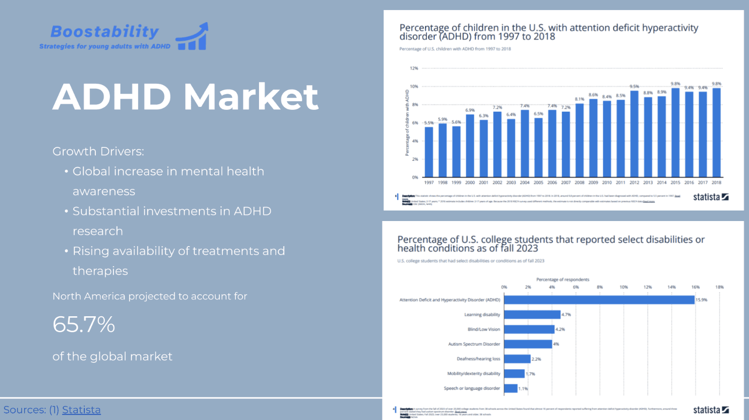
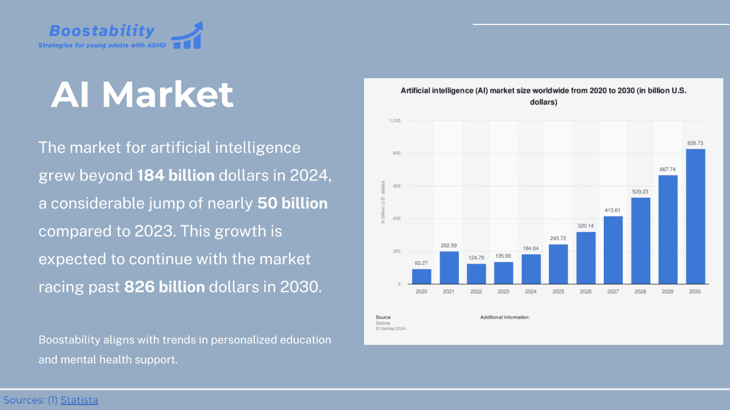
Business Impact
03
Discovery
Interviews (10)
The team conducted user interviews specifically with diagnosed ADHD students to find user archetypes that would inform the design. In these interviews, we focused on students' experience with ADHD in school, their study habits, and the academic resources/toools they use.
Key Takeaways
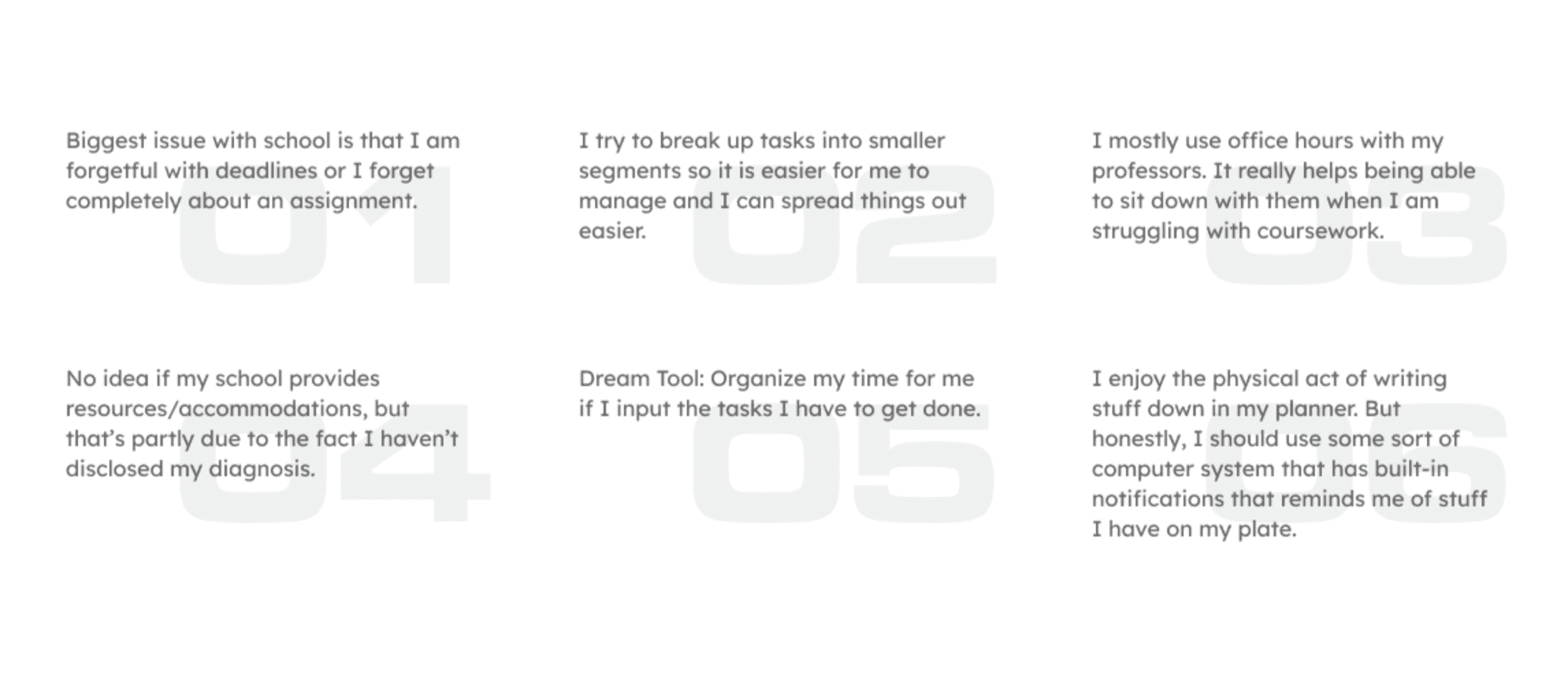
• Burnout is a major factor: many interviewees expressed feelings of discouragement, especially after seeing their peers excelling in areas they struggled with.
• Students need organizational resources: whether physical or digital, there was a definite need for task and time management tools (planners, calendars, etc).
• Digital resources + human interaction: while some interviewees loved the impact of digital tools, others preferred a human interaction when approaching academic tasks.
• ADHD stigma and accessibility resources: a small handful of interviewees used accessibility resources offered by their school (e.g. counseling, designated note-takers), but a majority preferred not to disclose their ADHD diagnosis.
User Personas
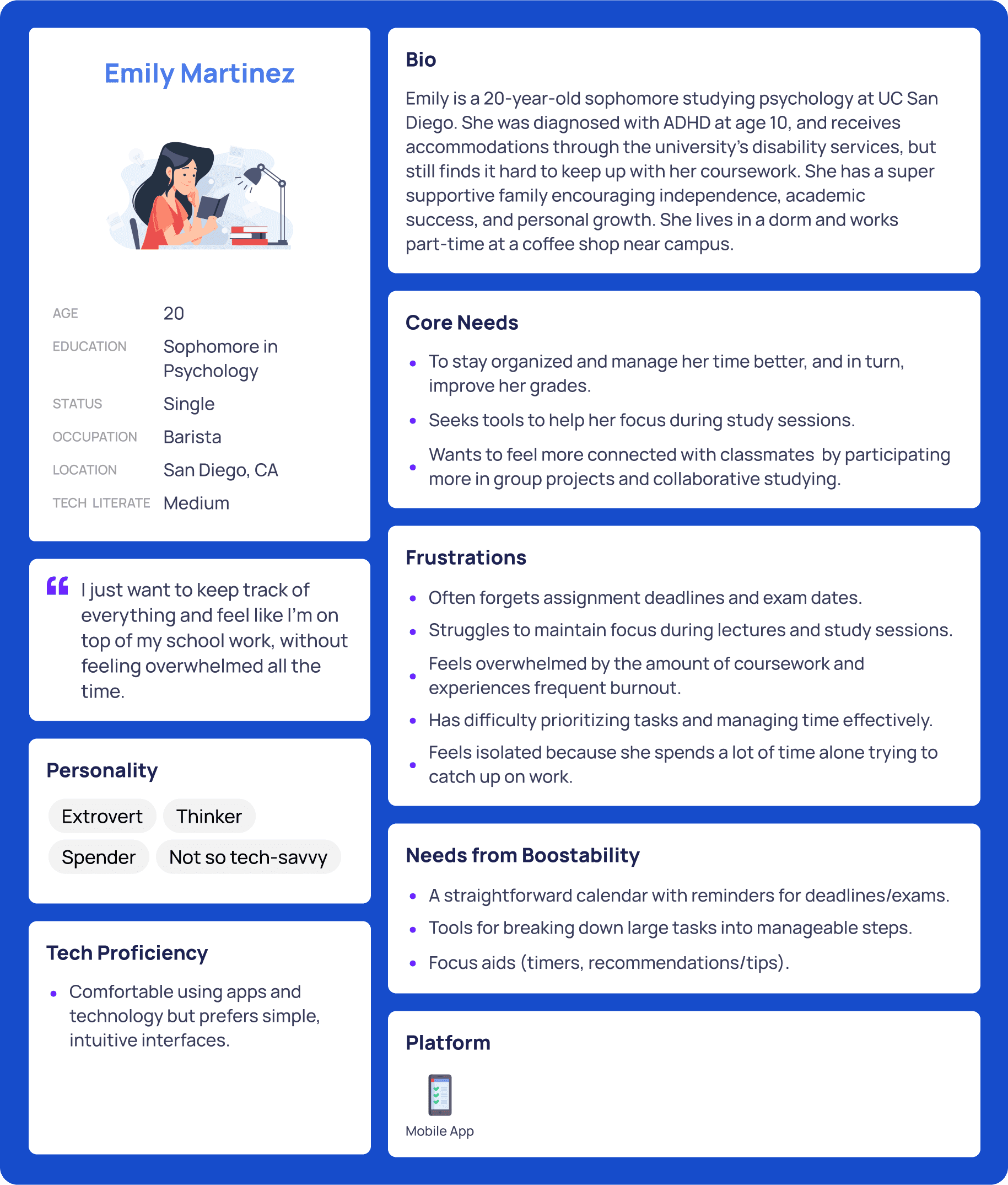
We wanted to form a deeper understanding of our users' experiences, core needs, and frustrations. So, we created two personas for Boostability users based on our interview findings. One that represented the forgetful/disorganized, burnt out, and not-so-tech-savvy ADHD student, and another that represented a strong student who needed a task-management system to help them juggle a heavy load of academic and extracurricular activities.
Learning
Stakeholder Wants vs. User Needs
While creating user personas, we discussed potential device preferences for users (mobile, tablet, desktop). Our user interviewees expressed a need for study reminders (i.e. push notifications), and easy access to their academic tasks while on campus. Therefore, the product team felt a mobile-first design would be most appropriate. But the CEO pushed back hard on this idea, insisting we'd be building a desktop app (I assume because she had seen one competitor do it that way).
This went against the team's preference for mobile-first design, and complicated the process for sending study-reminders to students in the app. In hindsight, we should have conducted a survey asking students their preferred device for academic task management. I think if we had presented the CEO with enough supporting data, she would have come around to the idea of a mobile app. This was not only a learning point for when additional research is necessary, but was also a lesson in managing stakeholder relationships.
05
Design
Information Architecture
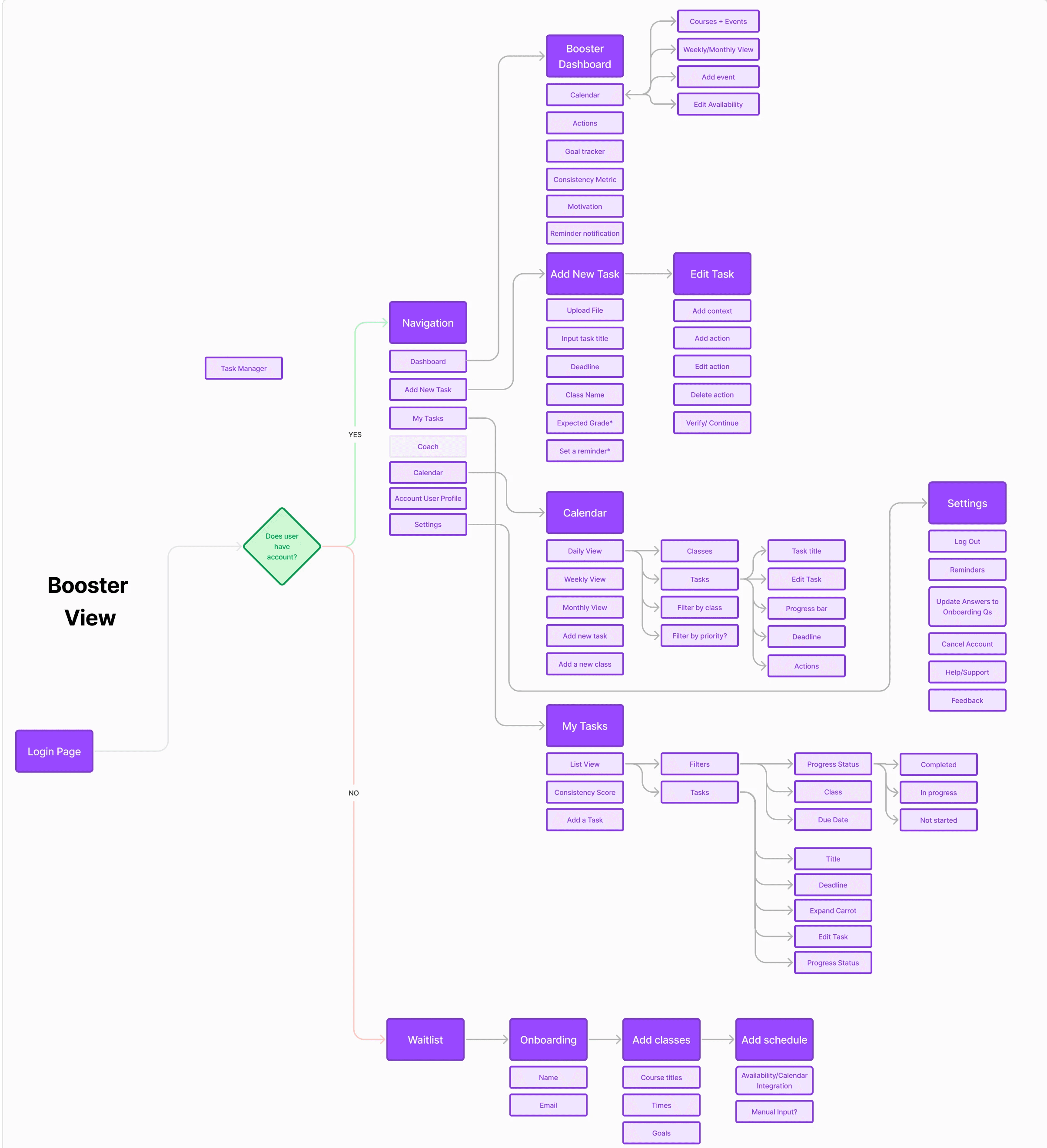
We needed to make sure the user journey for students was as smooth as possible, so we started laying out all potential use cases they might encounter and built a sitemap from them. My job was to focus on the app's primary use case: the process of adding a new academic task, using the AI to break it down into smaller action items, and the ability to edit those actions.
Low-fi Mockups
Using Figma, we translated our first sketches of the "Add/edit-a-task" flow into a low-fidelity prototype. The goal for this first round of wireframes was to be VERY high-level, just to get a visual sense of the flow for adding an academic task. This mockup would include the following:
Selection of adding an academic task from the main dashboard.
Uploading an academic document (e.g. a class syllabus or study guide).
Selecting an expected grade for the task.
AI breakdown of task into smaller action items.
Confirmation of completion
Hi-fi Mockups
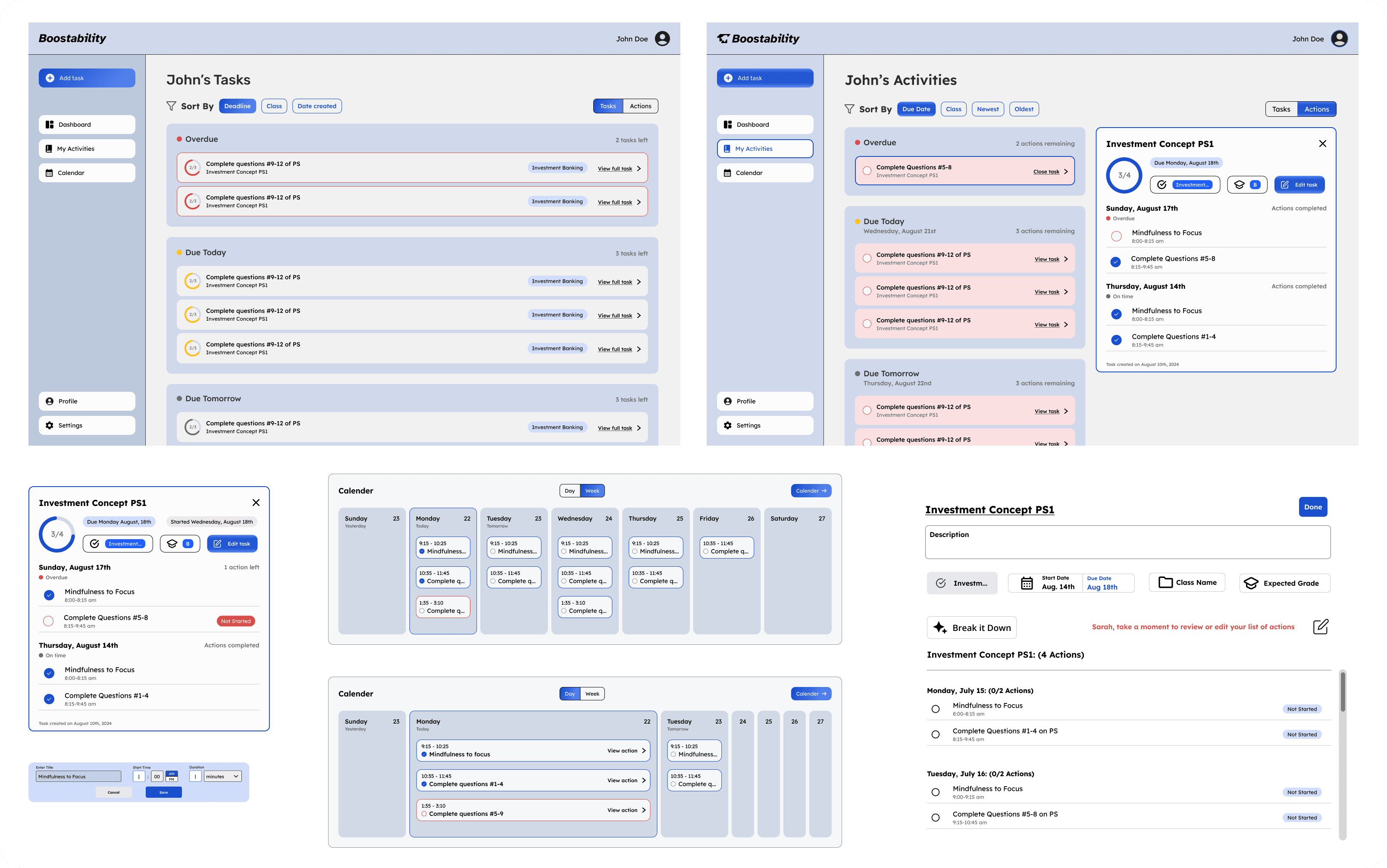
I spent a good chunk of time adapting our original wireframes into a high-fidelity prototype, which incorporated more detailed interactions when adding an academic task, and linked it with the main dashboard of the site. It would include:
Adding a task: task title/description
Uploading an academic document (e.g. syllabus, study guide)
Due date selection from calendar, reminders for selected due date
Adding task to a class folder
Expected grade selection
AI breakdown of task
Confirmation of completion
06
Iterate
Due to time constraints of Boostability's internship program, we unfortunately did not have the ability to conduct usability tests with ADHD students. However, upon sharing our designs with the Development and Business Strategy Teams, we were able to identify some key issues with our prototype.
Key Issues
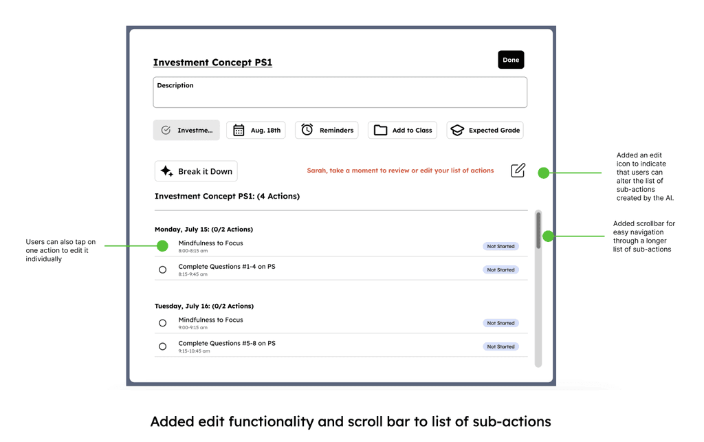
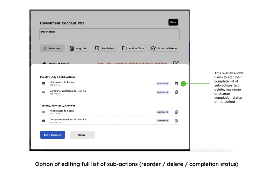
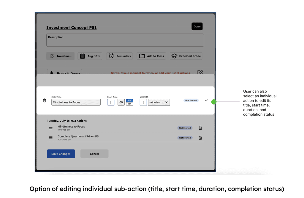
01 - Users need ability to edit action items created by the AI. This includes the ability edit their list of action-items as a whole, as well as the ability to edit the details of an individual action-item.
02 - Users need the ability to scroll through longer list of actions (up to 8 created by the AI).
07
Reflect
Next Steps
Considering this project was part of a short term internship, I did not get to see it through to its final development and pilot program. That said, below are a few additional steps I would have taken if time were not a constraint.
01 - Adapt "Expected Grade" KPI
The CEO wanted us to use "expected grade" on each academic task as a KPI to measure the effectiveness of the application in helping students improve their grades. In my view, it makes more sense to track student grades/GPA for the course as a whole, rather than for each individual task because:
• Course grades / GPA are better long-term KPIs for student success
• Not every academic task is graded the same way, and is highly dependent on the type of task as well as the teacher's grading style.
02 - Add "start date" in addition to due date
Including a start date to the process of adding an academic task would likely provide the AI with more concrete parameters for how it breaks down that task into smaller actions.
03 - test, test, test
Additional usability tests for the application as a whole would be a non-negotiable. Not only would this help to improve functionality of my portion of the design, it would also ensure that each section of the application would integrate with each other seamlessly.

Learning
If there's no set standard for team communication/collaboration, or the existing standard is inefficient, speak up!
Throughout the first 2-3 weeks of this internship, designers were asked to complete their deliverables individually, with little-to-no collaboration outside of our Monday stand-ups. This siloing-off of the product team meant our work was limited to only one perspective, and it made for chaotic team meetings when everyone's deliverables took a different approach. We didn't know how to move forward from there, nor how a smattering of varied prototypes would work for handoff to the dev team. After the third week, we began insisting on a more collaborative process, establishing standard days/times for team communication. Not surprisingly, this change meant reduced bias in our designs, a more focused approach to wireframing/prototyping, and cleaner handoff to the dev team.
