Her Fantasy Box: Product Page Redesign
Her Fantasy Box is a brand offering intimacy and wellness products geared toward women. The client wanted to redesign all their Product Pages, with the aim of improving visual appeal, strengthening brand storytelling, and driving higher conversions. I was tasked with redesigning the Body Magic Chlorophyll Pill product page, among others.
The redesign needed to balance a fun, feminine brand voice with CRO best practices—delivering a seamless, engaging shopping experience optimized for both mobile and desktop users.
Tools
Figma
Adobe Creative Suite
Slack
team
1 UI/UX Designer (myself)
Contract work through Foreman Consulting
My Role
UX Research
UI/UX Design
Wireframing & Prototyping
Timeline
1 Week
Business Impact
A/B Test Results: GA4 Analysis
Purchases: +10.67% increase
Revenue: +19.27% increase
Engagement Rate: +16.80% lift
Supporting Metrics:
One-Time Purchases: +9.38% improvement
Decrease Bouncerate: +0.26% improvement
My Process
01
Discovery
I spent some time digging into the brand, reviewing what had already been designed, and checking out what competitors were doing—especially in the DTC wellness space.
Key Questions for CRO:
What are customers most worried about with a product like this?
What would make someone feel ready to hit "Add to Cart"?
Key Challenges Identified:
The product imagery was tough—inconsistent lighting, cropping, and quality meant I had to work around less-than-ideal visuals.
The brand already had a component library, but it needed expanding for this page—especially with icons, product-specific copy, and accessible color tweaks.
The client also wanted a new “Science Facts” section, but hadn’t nailed down what that would look like.
And of course, everything needed to align with CRO best practices to help drive actual sales.
02
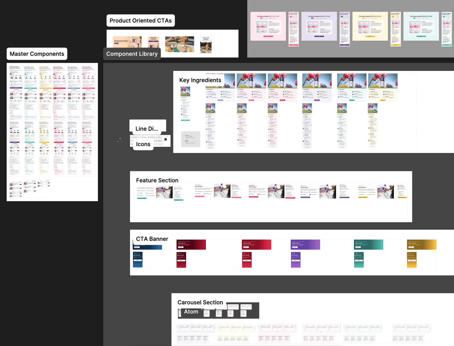
Component Library Expansion
I built on the existing component library by:
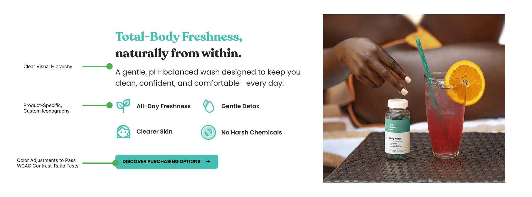
Designing a set of custom icons for product benefits like odor control, skin health, and taste—each one simple, feminine, and easy to understand at a glance.
Adjusting the color palette to ensure everything passed WCAG contrast checks, while still feeling soft and brand-aligned.
Adapting copy to suit Body Magic, while maintaining the overall brand voice & tone of Her Fantasy Box.
Keeping things modular, so the design team could reuse elements across future product pages.
03
Designing for Conversion
The new layout was built to guide the user:
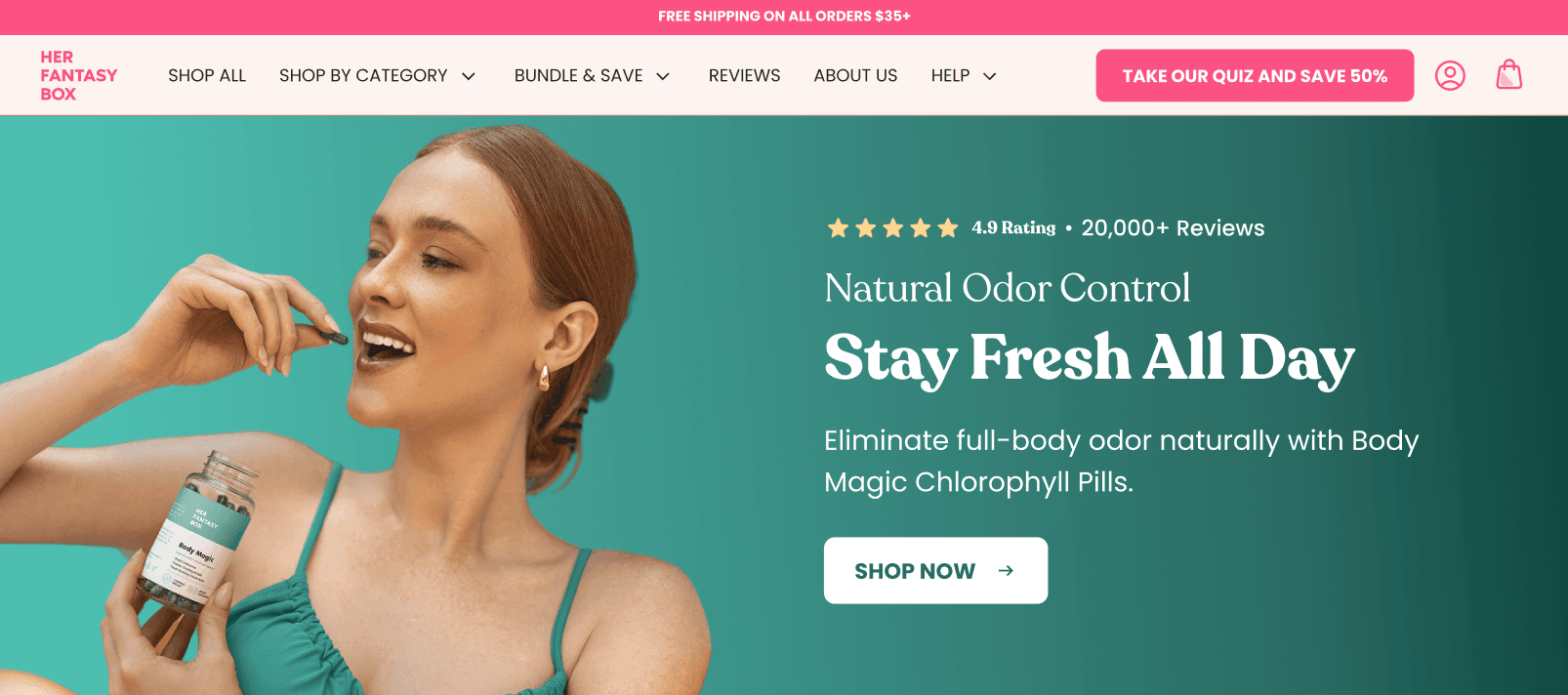
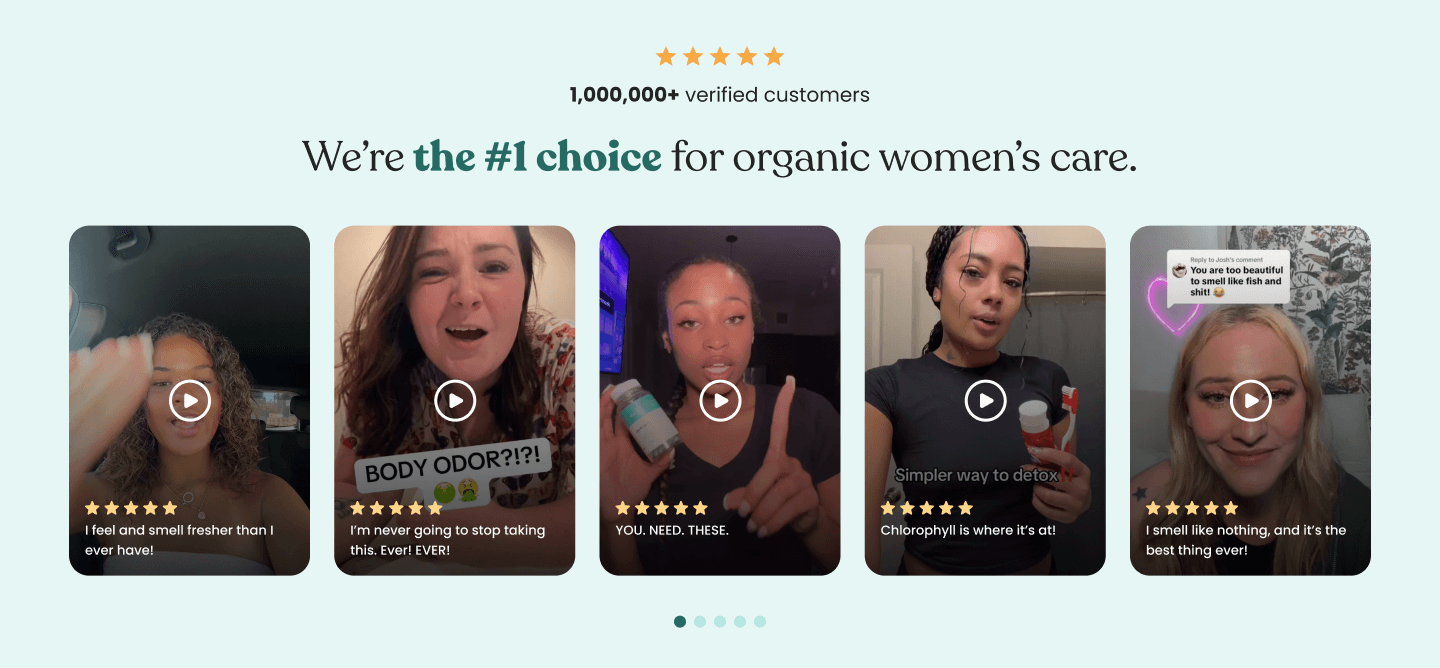
A strong hero section with clear product identity and social proof
A clean Product Action block, complete with value props, upsells, and social proof
A brand-new “Science Facts” section, built to educate without overwhelming
Sticky CTA behavior and clean mobile responsiveness throughout
A few CRO Highlights:
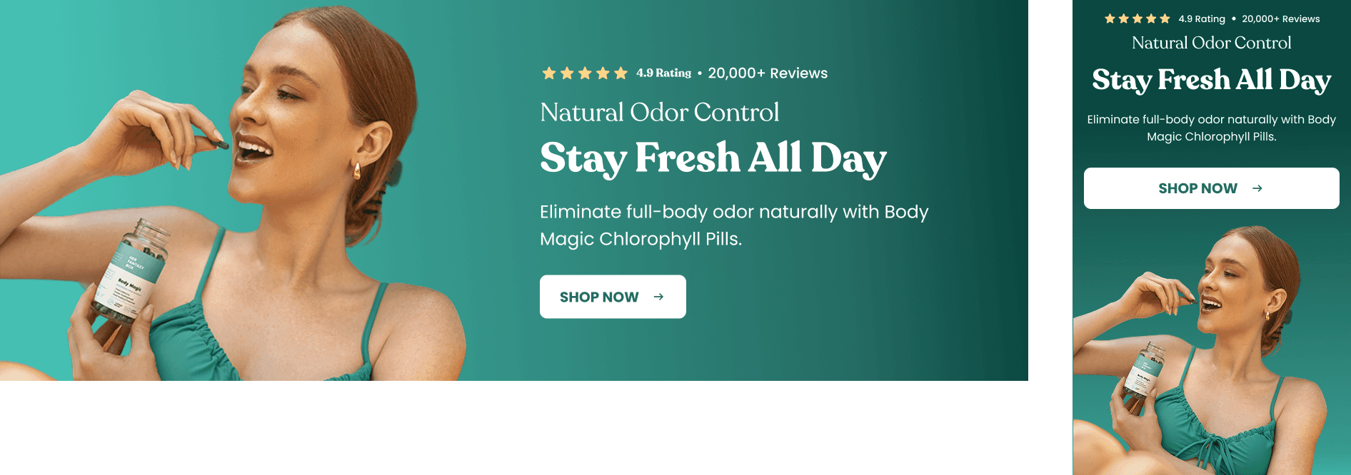
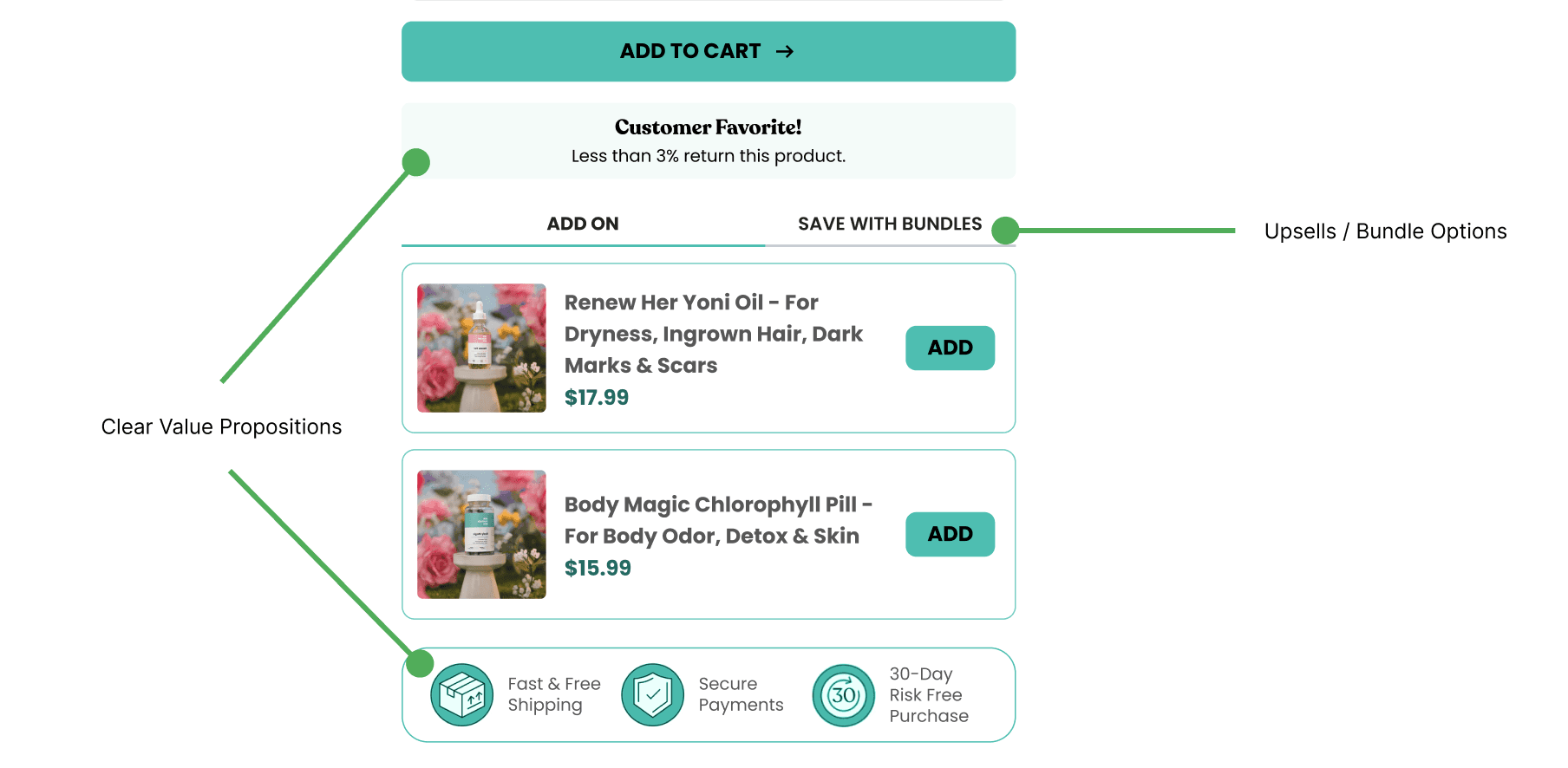
clear social proof
04
Problem Solving: Science Facts
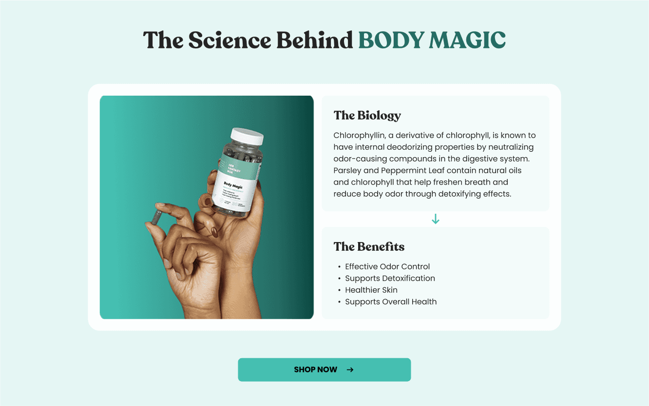
The "Science Facts" section was one of the most interesting—and ambiguous—parts of the project. The client knew they wanted a way to explain why their products works, but didn’t have a clear idea of how that should be structured or styled.
Starting Point
The client had provided a list of five benefit categories they wanted to address in the Science Facts section for all products: Odor, Dark Spots, Taste, Ingrown Hairs, and Skin Dryness. I needed to figure out a design that would fit all these categories, and that also:
Is scalable for all products
Feels approachable, not clinical
Stays on-brand with the rest of Her Fantasy Box’s playful tone
Is scannable and visual, especially for mobile users
Builds trust through light science without overwhelming people with technical jargon
Ideation
I started by creating custom icons for each benefit category, using simple, clean shapes that still felt feminine and a bit fun.

I then began experimenting with different layouts that allowed each benefit to stand on its own, with a clear visual anchor (icon) and short supporting text. The goal was to keep it high-impact and lightweight, especially for users who scroll quickly. Some of these initial designs used hover interactions, whereas others used a simple list format.


Honing In on a Solution
After a discussion with the product team, we realized that not all benefit categories applied to every product. For example, Body Magic has no effect on Dark Spots or Ingrown Hairs, and since it's a supplement it has no real taste. As a result, we decided to simplify our approach of the Science Facts section. This involved breaking the content into two parts:
The Biology – A short explanation of how the main ingredients (e.g. chlorophyllin, parsley, and peppermint leaf) work from a scientific perspective.
The Benefits – A consumer-friendly breakdown of what those ingredients do for the user, written in accessible, scannable bullet points.
05
Final Design
Here’s what the final redesign delivered:
Improved accessibility while preserving brand character
Expanded component library ready for future product pages
Stronger product storytelling through the new Science section
Clearer, more persuasive page structure to drive conversions
Responsive and mobile-optimized design for better user engagement across devices
Final designs were packaged for A/B Testing against the previous version. Key success metrics identified: Add-to-Cart click rate, Overall Conversion Rate, Engagement, Revenue Per Visitor.

Key Learnings
Strategic small changes (like better color contrast and clearer value props) can have major impacts on trust and conversion.
Component libraries need to be living systems: expandable, adaptable, and always accessibility-first.
User education (like a Science section) must be visually digestible and tightly connected to user purchase motivations.
Problem-solving imagery limitations through thoughtful framing and layout can save time, cost, and improve perceived brand quality.