iCoStore: Swag Store Landing Page
iCoStore helps companies simplify branded merchandise through custom, on-demand swag stores. When they introduced their “Swag Store” service, they needed a landing page that clearly explained the offering, built credibility, and encouraged visitors to take the next step of booking a consultation call or exploring examples.

Tools
Figma
Adobe Creative Suite
Slack
team
1 UI/UX Designer (myself)
Contract work through Foreman Consulting
My Role
UX Research
UI/UX Design
Content Design
Timeline
2 Days
The Challenge
This Landing Page design required a focus on what makes the Swag Store unique in a sea of competitors: full-service support, no inventory headaches, and an easy launch process. In collaboration with the Foreman Consulting team, our goal was to:
Explain the value of a Swag Store without overwhelming users with technical detail
Drive lead generation by encouraging discovery calls and demo requests
Build trust/credibility through social proof and real-world examples
Create a page structure that could scale with additional use cases and industries over time
Business Impact
While we don’t have hard numbers to share yet, qualitative feedback from the client was overwhelmingly positive.
Clearer Service Storytelling: Instead of needing to explain what a Swag Store is on sales calls, prospects come in already aligned with the concept and excited to learn more.
Stronger Branding: This landing page matched the quality of iCoStore's service, and became a strong brand touchpoint.
Reusable Content: The structure and copy from this landing page is currently being used to build other landing pages for the client.
My Process
01
Discovery
Before jumping into design, I took some time to understand iCoStore’s business goals and their customers’ needs.
Product Team Ideation: I communicated with the Foreman product team, some of whom had experience designing prior landing pages for iCoStore. These conversations helped me identify the core messaging strategy—the page needed to educate first, then convert.
Competitive Analysis: I started looking into how similar brands structured their "custom swag" pages, while also reviewing common CRO tactics the Foreman team had used for prior clients. This helped me put together a potential architecture for the page.
Content Audit: I also took an inventory of swag-related assets from existing iCoStore pages, looking for reference points for copy to help shape the Swag Store narrative.
02
Design Strategy
The core design strategy centered around building trust quickly, guiding users through an unfamiliar service, and driving action. Set goals included:
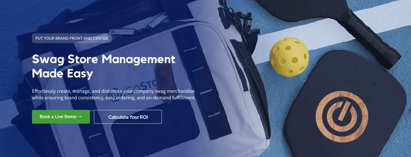
Hook with Clarity: Communicate exactly what the Swag Store offers in the Hero section, in under 5 seconds.
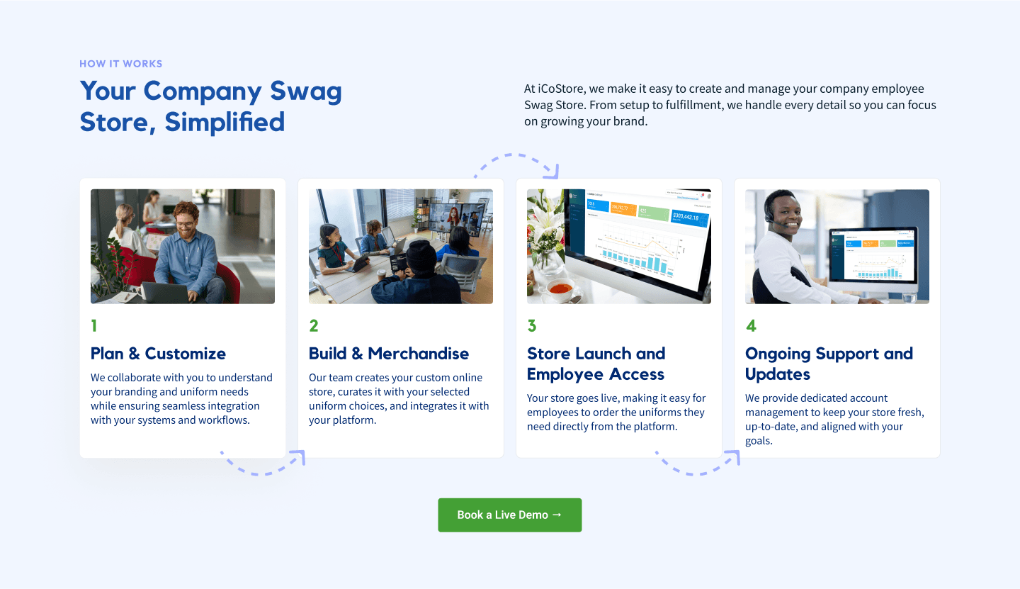
Explain, Don’t Overload: A step-by-step visual flow to show how the process works.
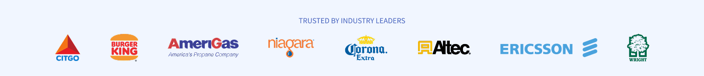
Reinforce Credibility: Prioritize social proof with client logos, testimonials, and live store examples.
Design for Scale: Build with modularity in mind, in case iCoStore needs to expand or swap content for different industries/campaigns later on.
03
Ideation
I began sketching out a couple potential layout options, and shared them with the Foreman team to get some clarity and direction. These low-fidelity wireframes helped us quickly validate content hierarchy and user flow before jumping into Figma. Once that structure was locked, I moved into high-fidelity design and began layering in brand visuals and copy.
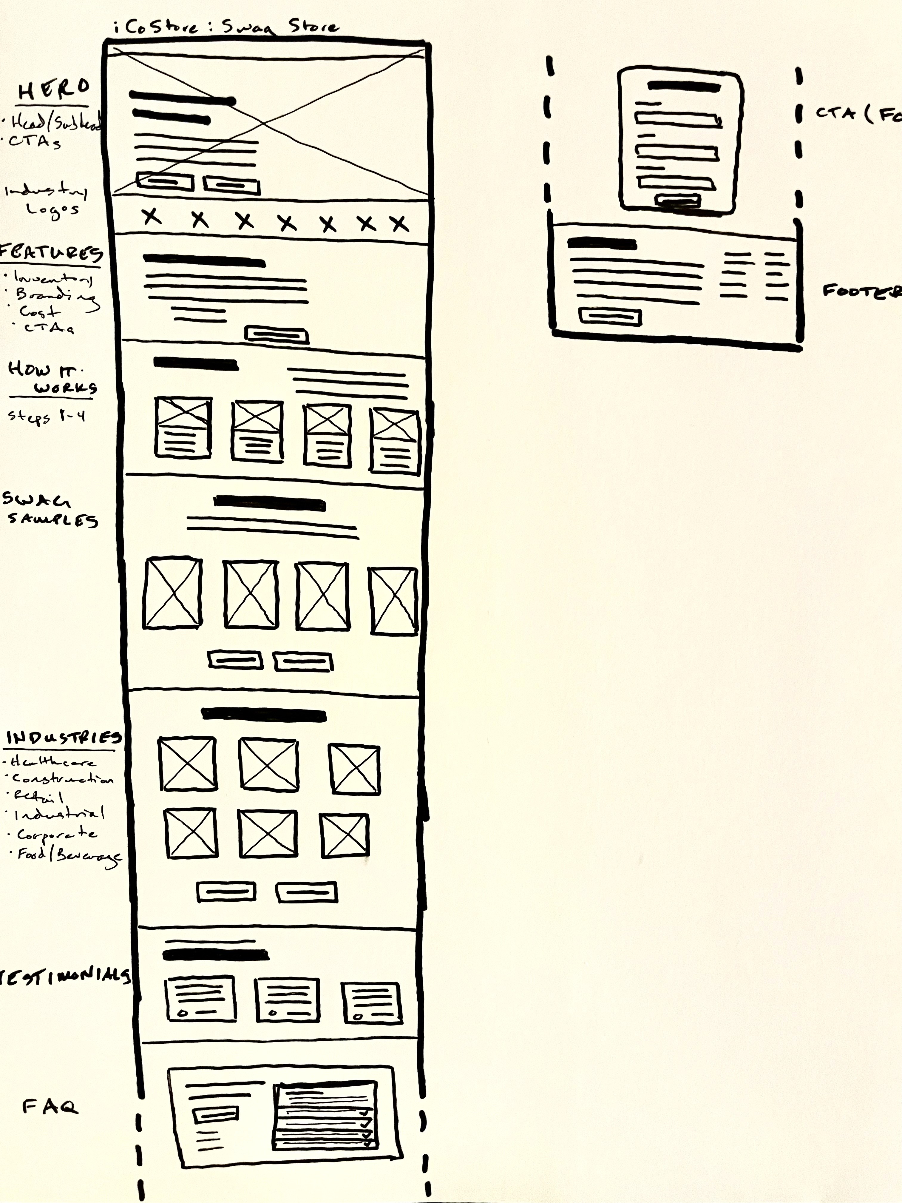
Page Architecture

how it works section
Guiding the user through the Swag Store journey:
Plan & Customize
Build & Merchandise
Store Launch & Employee Access
Ongoing Support & Updates
Images + short blurbs so the process feels simple, structured, low-stress.
Strong CTA to provide clear next steps.
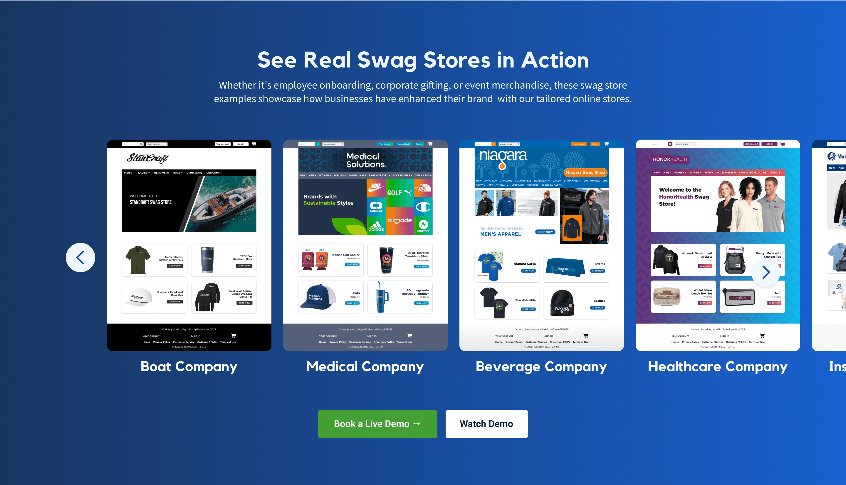
Store Visuals Section
Carousel to show actual examples of live Swag Stores from a wide range of industries.
Serves users as both inspiration and validation.
CTAs for actionable next steps.
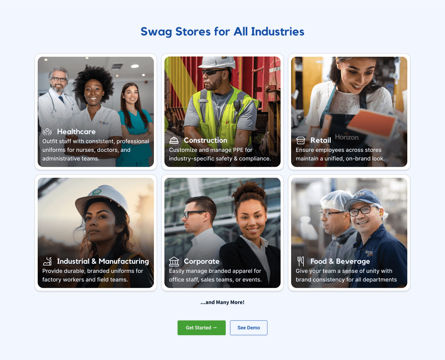
Industries Section
To support SEO and broaden appeal, shows Swag Store adaptability across multiple industries.
CTAs provide actionable next steps.
Testimonials section
Real voices to reinforce iCoStore's responsiveness and efficiency.
Another row of client logos for added trust.

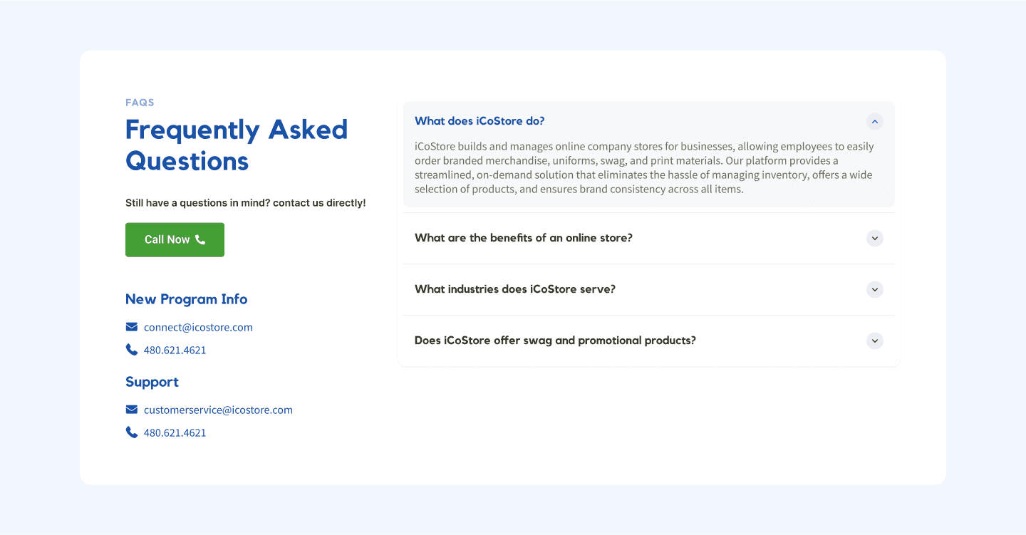
FAQ Section
Addresses common concerns to remove friction
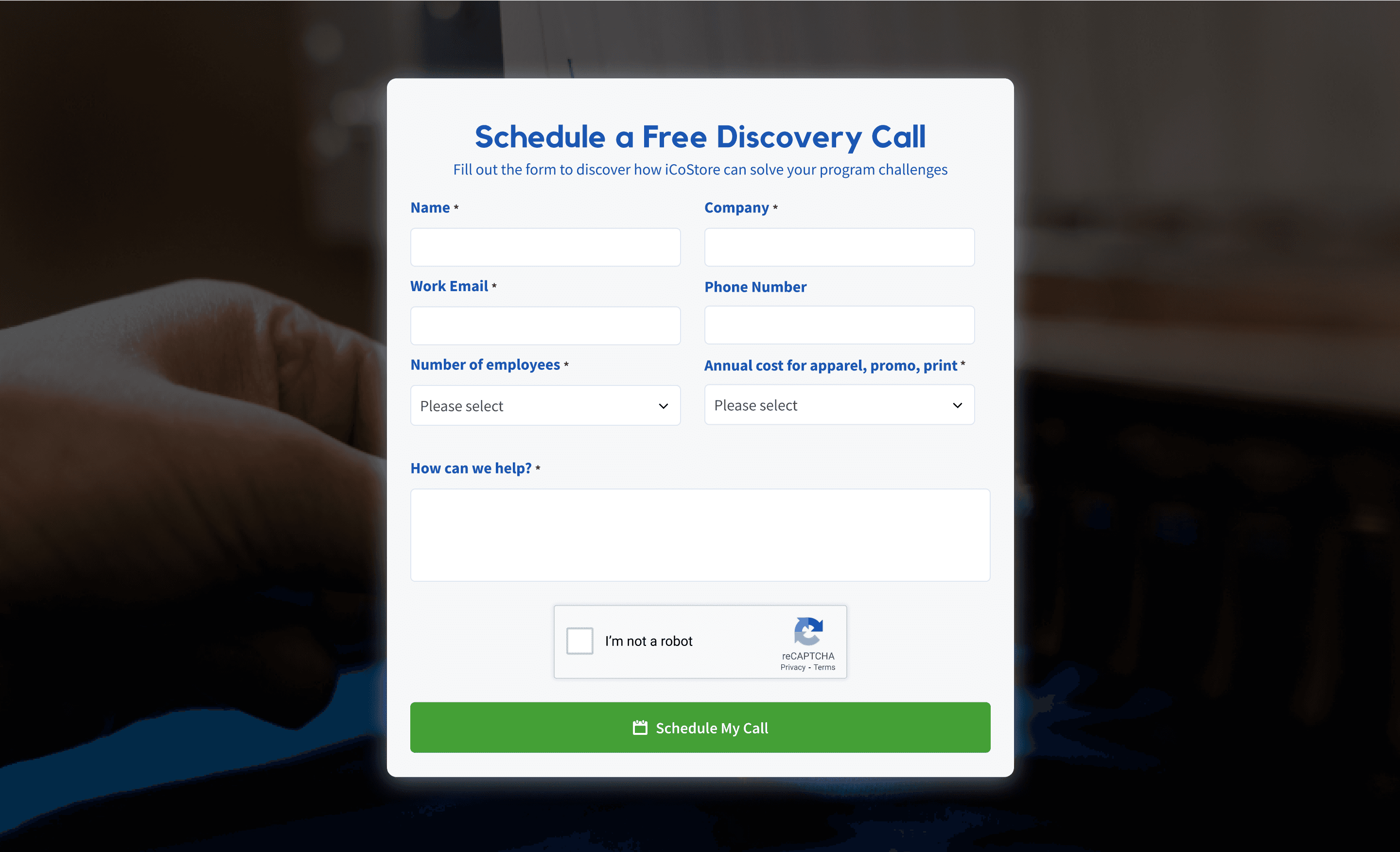
CONTACT FORM SECTION
Approachable and minimal form field to reduce friction.
Blurred background photo hints at fulfillment logistics for subtle reinforcement.

Key Learnings
Clarity outperforms complexity: Simple, well-structured messaging (and stripping away jargon) helps maintain focus on the user journey.
Sales teams need design support: A landing page is a tool the iCoStore sales team can lean on—a reminder that good UX extends beyond the browser.
Modular design pays off: Structuring the page with reusable sections (e.g. use cases, testimonials, or FAQs) provides flexibility for expansion/customization.
Next Steps
01 - A/B Testing Headlines or CTAs
Now that the foundation is solid, testing variations of the hero headline or CTA copy could help fine-tune conversion rates even more.
02 - deeper industry personalization
Since the Swag Store serves multiple industries, creating segmented landing pages for verticals like healthcare, manufacturing, or tech could boost relevance and performance.