FitOn + AI FitBuddy
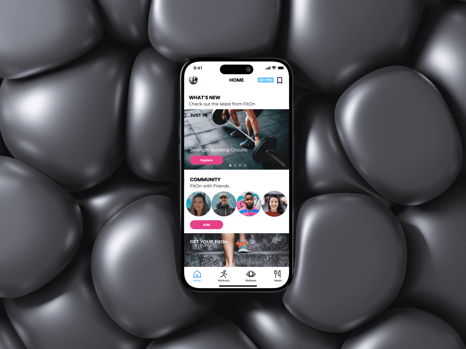
FitOn is a Los Angeles-based "hybrid wellness platform made for the hybrid workforce." The app offers workout videos, meal plans and recipes, and informational articles on exercise, mental health and nutrition. Essentially, FitOn aims to be an accessible workout and wellness app that's adaptable for any user's lifestyle.
Tools
Figma / Figjam
Mural
Google Docs
My Role
Solo Project:
UX Research
Information Architecture
UX/UI Design
Wireframing & Prototyping
Timeline
Overall: 4+ weeks
Discovery & Research: 1 week
Design: 3+ weeks
01
Problem
Simply put, the app is messy!
Although their intentions are good, FitOn offers too many avenues for finding a workout, self-care advice, and meal plans. With so many features being thrown at you on each page, the user is overwhelmed with options and unable to navigate the app efficiently. There is also tons of redundancy in terms of sub-categories for workouts, and too much variation in how those workouts are presented visually.
02
Solution
A full redesign of the mobile app, which includes:
Simplified global & local navigation
Narrowing sub-categories for Workout types
Expansion of the "Saved" function to include both Saved Workouts and Saved Recipes
Visual consistency across pages

A quick heads up: this project was an unsolicited redesign of the FitOn app. I used the app frequently during the COVID-19 pandemic to stay physically/mentally healthy while in quarantine, and I wanted to challenge myself to design a more intuitive interface for the app, just for fun!
Once the redesign was complete, I decided to expand on it by exploring the concept of an AI Fitness Trainer, whom I called FitBuddy. See FitBuddy details here.
Check out the final prototype here!
03
Discovery
I knew from the onset that this was going to be a sort of "quick and dirty" redesign, so my research process was relatively simple. It involved the following:
2 User Interviews
2 Card Sorts
2 Competitor Analysis
Interviews (2)
I interviewed two pals who have experience using FitOn, while also drawing on my own experience to make design decisions. I wanted to discover other folks' opinions on the strengths/weaknesses of the app, and identify what features they used most/least.

Key Questions
What methods of organizing workouts, self-care/wellness advice, and nutrition tips are optimal for users?
Is there a way to pare down FitOn’s current platform, so that content doesn’t overlap in too many areas of the app, to make navigation more intuitive? Are there any sections of the app that can be eliminated entirely?

Findings
It was unanimous-- the app is messy! Especially the Home (For You) page, which interviewees felt offered too many ways of categorizing workouts.
The tabs for "Course" and "Program" on the home page seemed redundant to users. Further indication that there's a lot of unnecessary content there.
People don't really use the "Friends" social media page very often, so maybe it shouldn't be part of the main nav bar.
The Meals page was a more popular resource than expected, and deserves some love and attention.
"I would like a better organized main page. Some of the features seem a bit extra. For example— connecting contacts, challenges, achievements, programs, it's all too much."
— Interviewee #1
Card Sort (2)
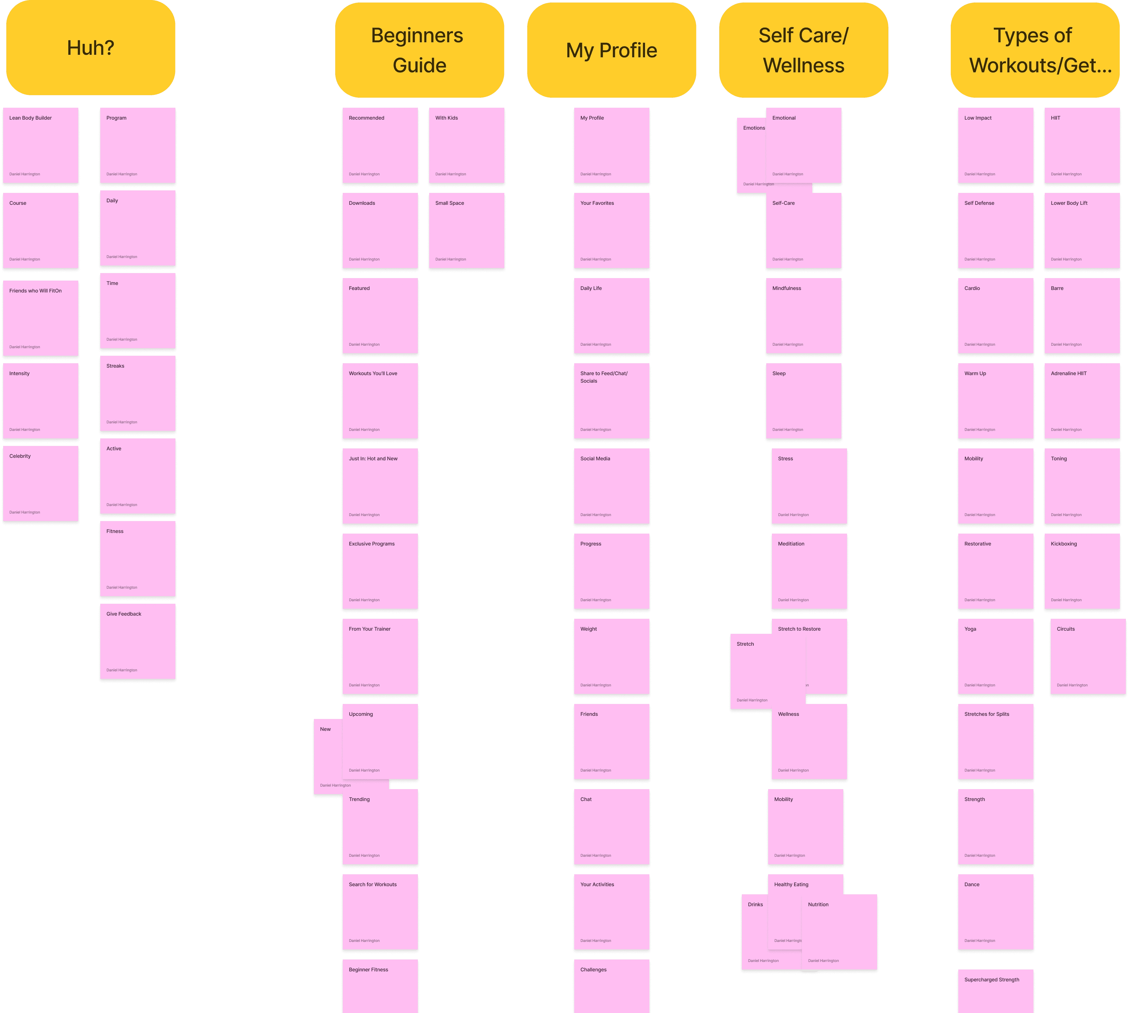
I opted for an open Card Sort to figure out how I could simplify the Navigation for FitOn. I did, however, instruct participants to create a specific group for items that they were confused by, or that they didn't feel belonged anywhere specific. I called this the "Huh?" category, so I could find out what features and labels may be unhelpful or redundant to users.
Findings
Both users grouped "Friends" and other social media terms under the banner "My Profile". This offered another location for this feature rather than in the main nav bar.
Neither user understood the difference between "Course" and "Program," which are two main sub-categories on the For You page. So, I knew I could find a new way to organize those offerings.
Unsurprisingly, there were quite a few elements categorized under "Huh?". I used these as a starting point for sub-categories of workouts that I could eliminate.

Learning
Card sort approach
Considering the amount of content on the FitOn app, my Card Sort ended up being BIG... like, REALLY BIG. This was not only frustrating for participants as it was a lot to organize, but it also made it more difficult to analyze the results. I think if I were to do this again, I'd likely do a semi-closed card sort by specifying the main (global) navigation labels I planned on using for the redesign: Home, Workouts, Wellness, and Meals. Then, I'd allow users to create their own sub-categories under each, and group things however they see fit. This would've made for a simpler Card Sort for participants, and one that would help me better identify how local navigation might work within each page.
Competitive Analysis
Nike Training Club
This exercise app is way cleaner than FitOn. Much easier to navigate and find workouts, greater consistency in UI elements, and simpler local navigation. NTC's fatal flaw, however, was that it did not offer as much as FitOn in terms of wellness tips, meal plans, or recipes, and those that it did offer were not categorized at all.
NYT Recipes
The use of NYT Recipes was primarily to see how I could organize the Meals page of FitOn, and what each individual recipe might look like. I liked how NYT splits each recipe into "Ingredients" and "Steps" once you start cooking. This also gave me the idea of the ability to save both Workouts and Recipes.
04
Ideation
Sitemap
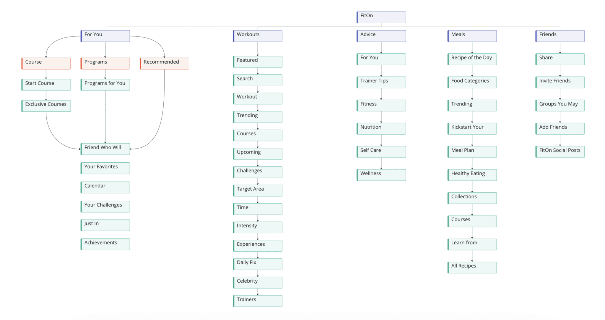
Vertical site structure: too much content, too much scrolling
The original FitOn site structure included five global navigation options: For You, Workouts, Advice, Meals, and Friends. The only page that contained any subdivision of content was "For You," although those subdividers-- "Programs" and "Courses"-- were redundant. As a result, the app had a very vertical site structure, which meant a lot of scrolling to find resources.
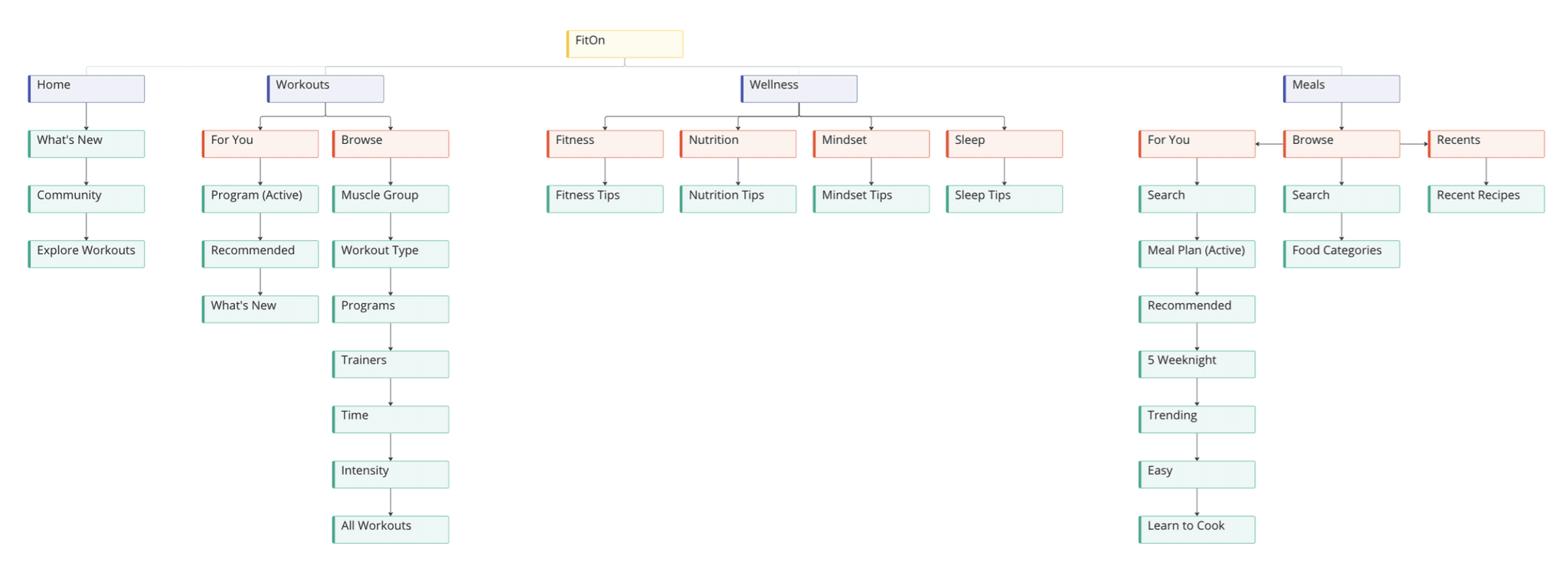
Horizontal site structure: organized navigation with reduced content, sub-divided pages
User Interviews indicated that the "Friends" feature wasn't commonly used, so it didn't really need to be a mainstay of the Nav Bar. I decided to move it under My Profile, thus narrowing the main navigation bar to just four options: Home, Workouts, Wellness, and Meals. I then sub-divided each main page into categories as needed, based on select groupings I had found from my Card Sorts. The result was a much more Horizontal site structure, and one that could be navigated without the user feeling overwhelmed by the amount of content.
Sketches
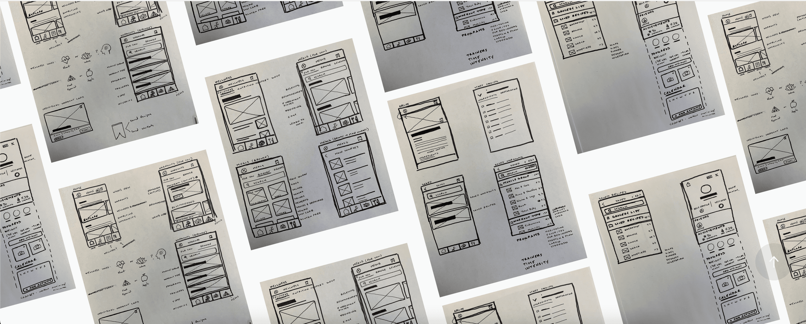
I put all my research to work by coming up with some low-fidelity sketches. They helped me in a few ways:
To get a visual understanding of site structure, and to eyeball how much Figma wireframing/prototyping I'd need to do.
To help me develop ideas for iconography, buttons, and other UI elements.
To ensure that my designs were visually consistent, as that was a key issue with FitOn's original designs-- too many different ways of displaying the same content.
To develop my idea of expanding the Meals page to be similar to NYT Recipes.

Learning
mid-fi testing
Even though I had pretty detailed sketches and a strong understanding of site structure for this redesign, I do wish I had the time to make some medium-fidelity wireframes in Figma so that I could test them. I feel my redesign is much more intuitive and easy to navigate than the original, but I don't like making that assumption based solely on my own experience. I want to ensure that the changes I made work for everyone.
06
Further Exploration: FitBuddy AI Trainer
Rather than closing the book on this redesign, I decided to take it a step further by exploring the concept of an AI Fitness trainer. One who creates a workout regimen based on a series of survey responses input by the user. Take a look!
